| Index | Recent Threads | Unanswered Threads | Who's Active | Guidelines | Search |
| World Community Grid Forums
|
| No member browsing this thread |
|
Thread Status: Active Total posts in this thread: 60
|
|
| Author |
|
|
Former Member
Cruncher Joined: May 22, 2018 Post Count: 0 Status: Offline |
Love the new website design. Very attractive.
 |
||
|
|
Former Member
Cruncher Joined: May 22, 2018 Post Count: 0 Status: Offline |
Funny, you picked a Microsoft patch day to do this, not like we already had enough changes to deal with...
|
||
|
|
keithhenry
Ace Cruncher Senile old farts of the world ....uh.....uh..... nevermind Joined: Nov 18, 2004 Post Count: 18667 Status: Offline Project Badges: 


|
An aesthetic comment - you may want to update the forum banner image to match color-wise.
---------------------------------------- |
||
|
|
roundup
Veteran Cruncher Switzerland Joined: Jul 25, 2006 Post Count: 843 Status: Offline Project Badges: 


|
An aesthetic comment - you may want to update the forum banner image to match color-wise. True. The colors do not match at all. Apart from this I like the updated site - especially the accessibility improvements. I had no issues with both Firefox 3.5.3 and Safari 4.0.3 - but the colors ... |
||
|
|
Sekerob
Ace Cruncher Joined: Jul 24, 2005 Post Count: 20043 Status: Offline |
Frankly, considering screen real estate, I would not mind if the forum banner http://www.worldcommunitygrid.org/forums/mvnp...ges/4-0_title_forums1.jpg was lost completely. Presently on each page refresh less than half the page is actually threads or posts. Then integrate the <i>Forum</i> word into the main banner or some other highlight to emphasize one is on the forum.
----------------------------------------Also I see Welcome Back Sekerob way top... and Welcome Sekerob below the Forums banner... too much :D (this really is OT... move over to the S&F section. ;>) On Topic, finally went to open IE8 and visit the site. Looks absolutely equal to the FFX 3.5.3 rendered version... bit slower ;P Really like the rotation of the presented science on revisit of the front page. Whilst focused on attracting new members as the announcement explains, I do miss the member highlights / the section to push special events / science milestones, but guess we'll get over that :D
WCG
----------------------------------------Please help to make the Forums an enjoyable experience for All! [Edit 1 times, last edit by Sekerob at Oct 15, 2009 6:19:05 AM] |
||
|
|
knreed
Former World Community Grid Tech Joined: Nov 8, 2004 Post Count: 4504 Status: Offline Project Badges: 


|
We have removed the forum banner. That was a good suggestion. We are going to leave the dual welcomes at this moment. The top one represents that you are signed into the website and the bottom represents that you are signed into the forums. Although that should be seemless to you it is a useful debugging tool for us when we get reports of problems (the forums and the website are two different applications that use a single sign solution so that you only login once).
The 'tell-a-friend' and 'video' spots on the home page will be changed in the not too distant future to spots where we can announce things similar to the 'whats new' from the old design. Further out in the future the extra space in the sky in the clouds (part of the top banner on the website) will be used to announce facts and other interesting tidbits. |
||
|
|
Sekerob
Ace Cruncher Joined: Jul 24, 2005 Post Count: 20043 Status: Offline |
Roger Kevin, that was teleconnection of your thoughts into the ones
----------------------------------------I had v.v. what might be coming in the near future and how the front page is already overlaying the science graphics on the cloud background and thanks for outing the forum banner. Color scheme fixed with that too :O) One other thought I had was the left margin menu's and the drop out menus from the top bar. Was the plan to have them coexist maybe because the none modern browsers as nelsoc noted can't do all the new stuff?
WCG
Please help to make the Forums an enjoyable experience for All! |
||
|
|
Former Member
Cruncher Joined: May 22, 2018 Post Count: 0 Status: Offline |
On the homepage the foldout menu for Research is so long it opens up to the top and over the menu bar
----------------------------------------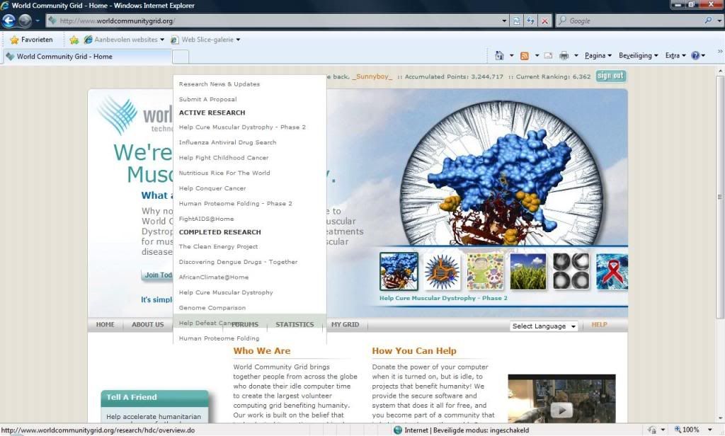 [Edit 2 times, last edit by Former Member at Oct 16, 2009 5:43:21 AM] |
||
|
|
Former Member
Cruncher Joined: May 22, 2018 Post Count: 0 Status: Offline |
I noticed the sign out button top right is different on the forum page than on the other pages
|
||
|
|
Sekerob
Ace Cruncher Joined: Jul 24, 2005 Post Count: 20043 Status: Offline |
edit: indeed here too signout button is the old one on the front page. edit2: The bar coming through the menu is an IE(8) thing maybe? See it in there but not on FFX3.5.3
WCG
----------------------------------------Please help to make the Forums an enjoyable experience for All! [Edit 2 times, last edit by Sekerob at Oct 15, 2009 9:17:50 PM] |
||
|
|
|