

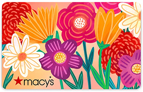

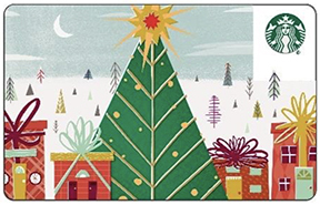

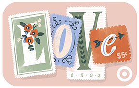




It's gift card time again Cherries! The challenge is to pick a gift card from the selection below and use it for inspiration for your layout, card, planner, or craft project. You can be inspired by any aspect of the gift card… the colors, objects on the gift card, and/or the design itself. Please let us know which gift card image you chose and what it was about it that inspired you. And most of all… have fun!
Open to paper, digi, cards, planners, crafts, or whatever this inspires you to create.
Since there are a lot of gift cards to choose from I am allowing multiple submissions up to a limit of 8, as long as each submission is from a different gift card… no multiple submissions from the same gift card. Because I am allowing so many submissions I will be picking multiple winners.
You may combine with one other challenge that allows combining and you may also add to the Prompts Challenge if there is one.
Since I am posting this so late in the month I am going to be running it into January. I like to give 2 full months because there are so many choices. Post your submission to this thread by January 19th. Multiple random winners of all participants will receive a $5 ACOT GC from me!
I hope you all have fun with this and get lots of inspiration from these gift cards.
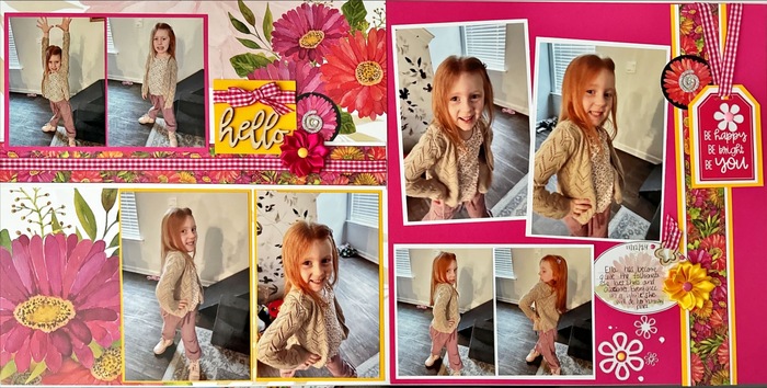
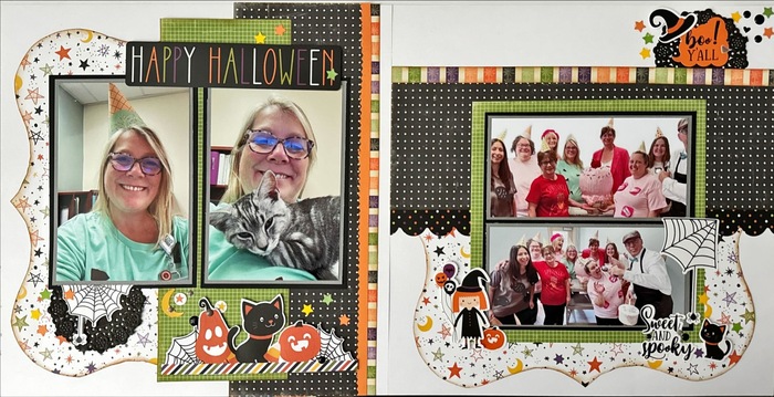
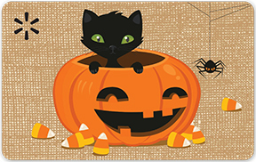
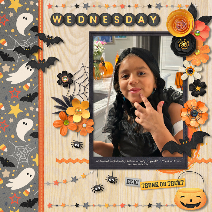
I am finding all these gift cards so inspiring and had trouble picking which one I wanted to use for my layout. The one I did choose is the Walmart Halloween gift card. I was inspired by the tan background along with it's orange, yellow, and black colors, and the touch of green in the cats eyes inspired a few of the flower centers (one of the beauties of digi, changing colors). I also was inspired by the Halloween theme, especially the hanging spider and the jack-o-lantern. Pic is of my sweet JJ dressed as Wednesday Addams, just before going out to trunk or treat this past October. I hope to do more layouts using some of the other gift cards as inspiration, and if I do get to doing any I will post them here.
Participants:
1. wazzu94
2. traveler
3. traveler
4. Breauxlabs
5. VickiR
6. Mommyof5
7. suewho372
8. wimom
9. Karyn_Sue
10. ScrappyRN74
11. ScrappyRN74
12. ScrappyRN74
13. ScrappyRN74
14. ScrappyRN74
15. Cynthia Corbett
16. wimom
17. wimom
Last edited by pawprints on Mon Nov 25, 2024 8:08 pm, edited 2 times in total.
6 users liked this post:
I chose this one:
I was inspired by the color of the sky is the color of my background, the tree, the packages along the bottom inspire the tickets and the title in the upper right by the logo
Louise
this time I chose this one
I was inspired by the colors and the white on blue lettering, also the shape looks a little like my photo in the lower right
Louise
For this one I used the colors of Kohls Merry Christmas
Kim Breaux
The Walmart Halloween card sounds like it was a perfect choice for your layout, especially with the Halloween elements and the colors.
1 user liked this post:
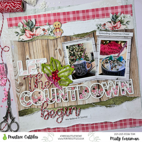
Here is my layout and my inspiration card.
Have a Wonderful Day! ~Misty
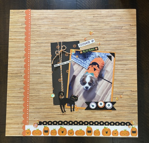
Here is mine ! I was inspired by the halloween gift card, and Barb's take on it too.
Susan
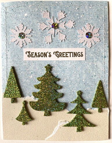
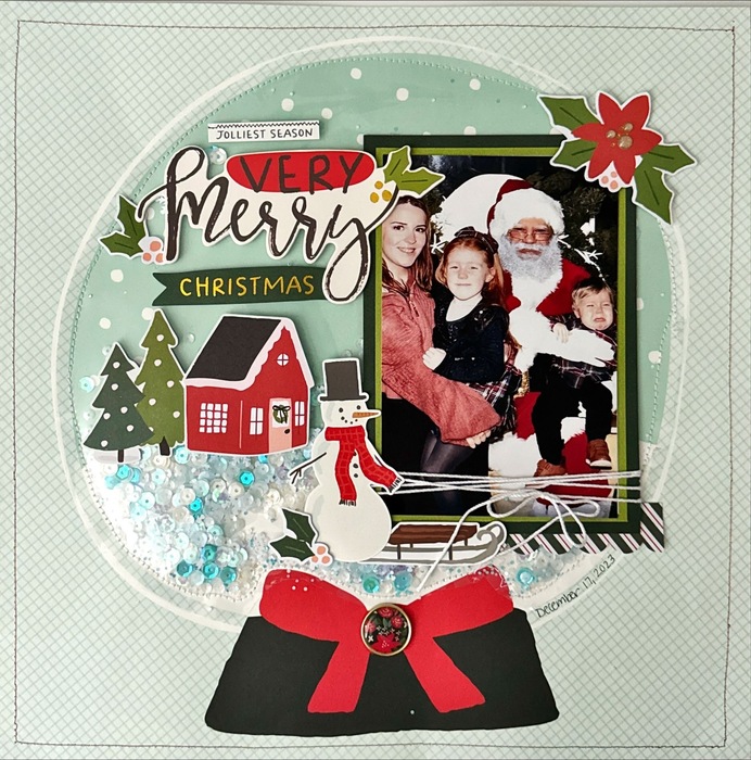
I uses the Walmart card with the winter scene of snow, trees and snowflakes.
Rhonda -- Scrappin' in Wisconsin
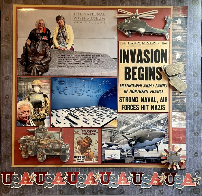
I know this is gonna sound a little out there, but the Walmart "just because" GC reminded me of a coast line, specifically the Normandy Beaches.
So it inspired me to do this layout about the WWII museum Normandy Beach landing exhibit.
Invasion Begins
So it inspired me to do this layout about the WWII museum Normandy Beach landing exhibit.
Invasion Begins
“The next best thing to the enjoyment of a good time, is the recollection of it.” — James Lendall Basford
I went with the Macy's card with the colorful flowers.
“Whatever you choose to do, leave tracks. That means don’t do it just for yourself. You will want to leave the world a little better for your having lived.” RBG
Trisha
Trisha
I was inspired by the christmas tree and presents on the Starbuck's card
“Whatever you choose to do, leave tracks. That means don’t do it just for yourself. You will want to leave the world a little better for your having lived.” RBG
Trisha
Trisha
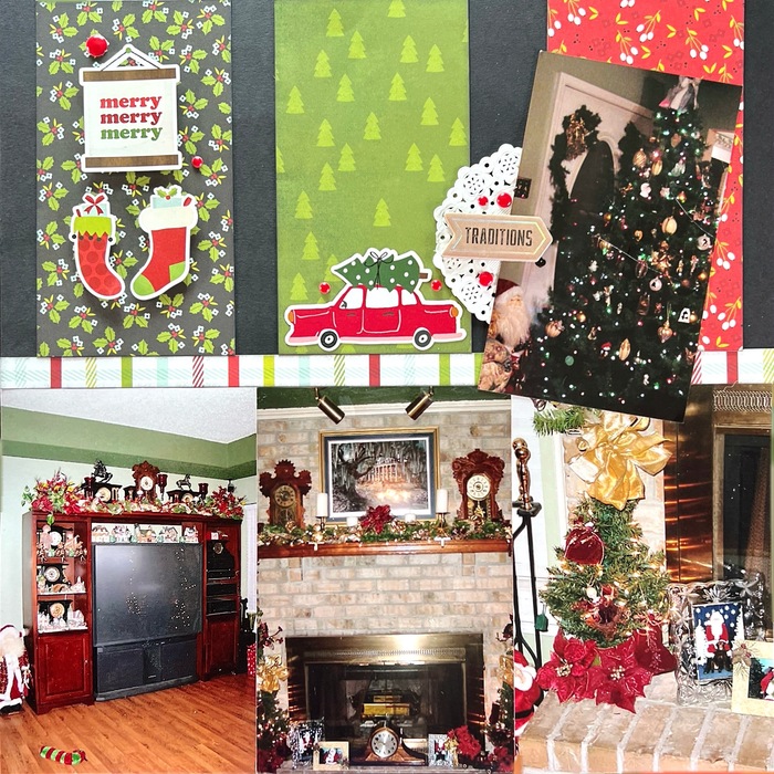
I was inspired by the Christmas Walmart card with teh Christmas trees and snowflakes.
“Whatever you choose to do, leave tracks. That means don’t do it just for yourself. You will want to leave the world a little better for your having lived.” RBG
Trisha
Trisha
I was inspired by the black cat and dangling spider on the Walmart Halloween card
“Whatever you choose to do, leave tracks. That means don’t do it just for yourself. You will want to leave the world a little better for your having lived.” RBG
Trisha
Trisha
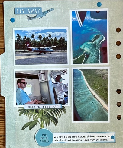
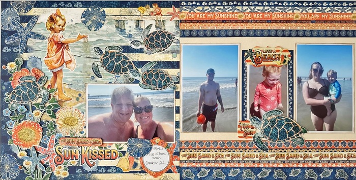
I used the Walmart beach card to inspire these photos of our beach vacation last fall.
“Whatever you choose to do, leave tracks. That means don’t do it just for yourself. You will want to leave the world a little better for your having lived.” RBG
Trisha
Trisha
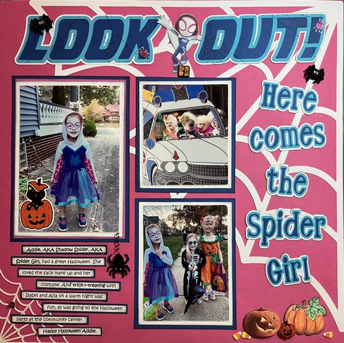
I chose the card with the spider, cat and pumpkin.
It was the spider that got me started since the layout is my granddaughter dressed like Shadow Spider from Spidey Jr. But when I was looking for pumpkins to add to the page, I found the one with the cat. Must be a match made in Heaven. Thanks.
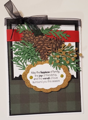
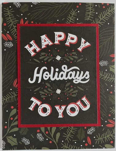
Number 2 from me. This one uses the Kohl's gift card with the black patterned background and white sentiment. When I saw that card I thought I remembered a very similar piece of patterned paper in my stash. Went through all my stuff and found it and a coordinating cut-apart card with a big white sentiment! Added a red mat and a couple of little white glittery bits to the journal card.
Rhonda -- Scrappin' in Wisconsin
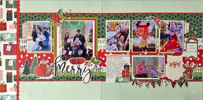
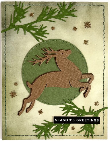
Number 3 from me, this one drawing on the Walmart "Bright Holidays" card. I used a big reindeer and branches in the corners, similar to the gift card. Also added some gold glitter stars for the "bright" lights on the gift card.
Rhonda -- Scrappin' in Wisconsin
Information
Moderators