| Index | Recent Threads | Unanswered Threads | Who's Active | Guidelines | Search |
| World Community Grid Forums
|
| No member browsing this thread |
|
Thread Status: Active Total posts in this thread: 6
|
|
| Author |
|
|
SekeRob
Master Cruncher Joined: Jan 7, 2013 Post Count: 2741 Status: Offline |
Well, 'design' is a big word, but just why it was chosen, if not forgotten, to not put the line frame on the diamond badges for the Microbiome Immunity Project is way over my IQ EQ CQ ratings. The below screenshot snip from the brag thread put the finger on the sore spot.
 It just does not look right, or  |
||
|
|
Former Member
Cruncher Joined: May 22, 2018 Post Count: 0 Status: Offline |
I have noticed the inconsistent framework for several days, SekeRob****
My badges are all frameless be they viewed in IE or Chrome for the time being - it varies. But then again: Who wants to be framed  |
||
|
|
Former Member
Cruncher Joined: May 22, 2018 Post Count: 0 Status: Offline |
MIP has not had the border from the beginning for diamond from what I remember. At least on my computers. I run chrome exclusively, so I can't say whether IE, FF, Safari, etc show different.
|
||
|
|
masteraip
Advanced Cruncher Bulgaria Joined: Jul 27, 2016 Post Count: 71 Status: Offline Project Badges: 


|
For me, the other annoying thing are the different colors between projects:
----------------------------------------- green background on FAH2 is different from OET1, - so are few blue badges and maybe others - the background color differs. I suppose they are made in different time frame and different people - but there must be a guideline for badge colors, so they all can have the same back color. |
||
|
|
SekeRob
Master Cruncher Joined: Jan 7, 2013 Post Count: 2741 Status: Offline |
Yes that too but some have to the eye a different hue, then when taking a color code picker, are actually same... it's how it's gets rendered as well, the missing frame though stands out as too simple to not be missed.
|
||
|
|
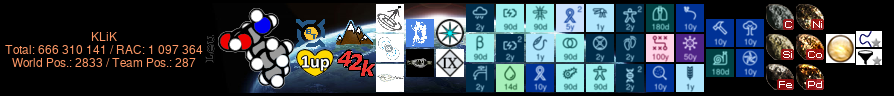
KLiK
Master Cruncher Croatia Joined: Nov 13, 2006 Post Count: 3108 Status: Offline Project Badges: 


|
Yes that too but some have to the eye a different hue, then when taking a color code picker, are actually same... it's how it's gets rendered as well, the missing frame though stands out as too simple to not be missed. +1 But also, when you reach a D badge, then (probably 'cause of the number) all pictures goes smaller. Why? To see more of graphics? Why do you need that? WCG should really redesign all badges & have a standard for it. |
||
|

|
|