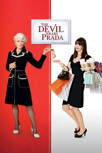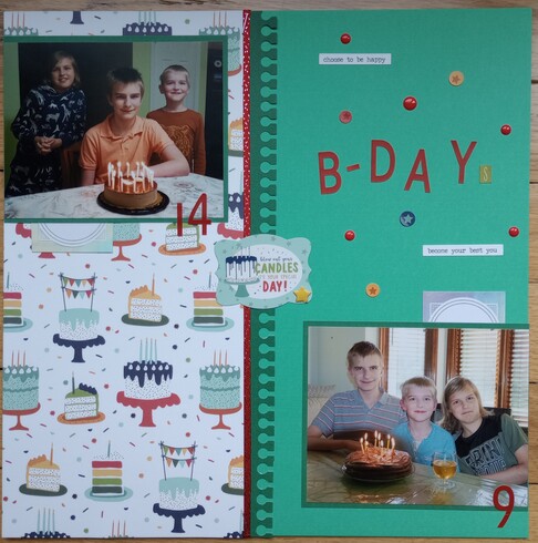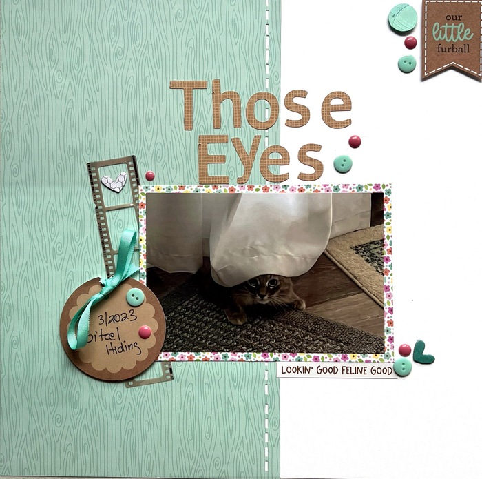
For this one I used The Devil Wears Prada. My inspirations were the split background, the stitching along the seam, pic in the middle and the devil herself.


Kim Breaux



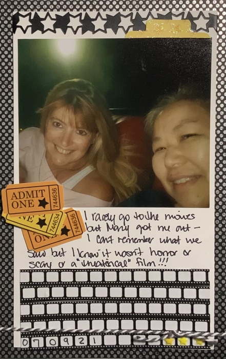
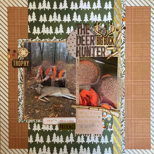
Movie Title - The Deer Hunter

~Brandi 
Follow me on Instagram! @scrappy.boymama


Follow me on Instagram! @scrappy.boymama


Thanks for putting so much thought into the different options for this new challenge!
I used the Poster option, the Hope Springs poster - I saw the design of two rows of photos. with the title below and journaling beneath the title.
I combined this with the 2-4-6-8 challenge.
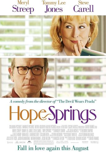
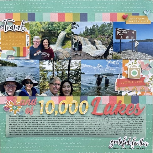
I used the Poster option, the Hope Springs poster - I saw the design of two rows of photos. with the title below and journaling beneath the title.
I combined this with the 2-4-6-8 challenge.


I chose the movie poster The Devil Wears Prada.
I chose the colour scheme of red. Black and white. I divided my page in two like the poster.. Two character- two photos. Title in a square at the top.
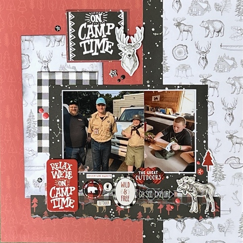
I chose the colour scheme of red. Black and white. I divided my page in two like the poster.. Two character- two photos. Title in a square at the top.


Leslee
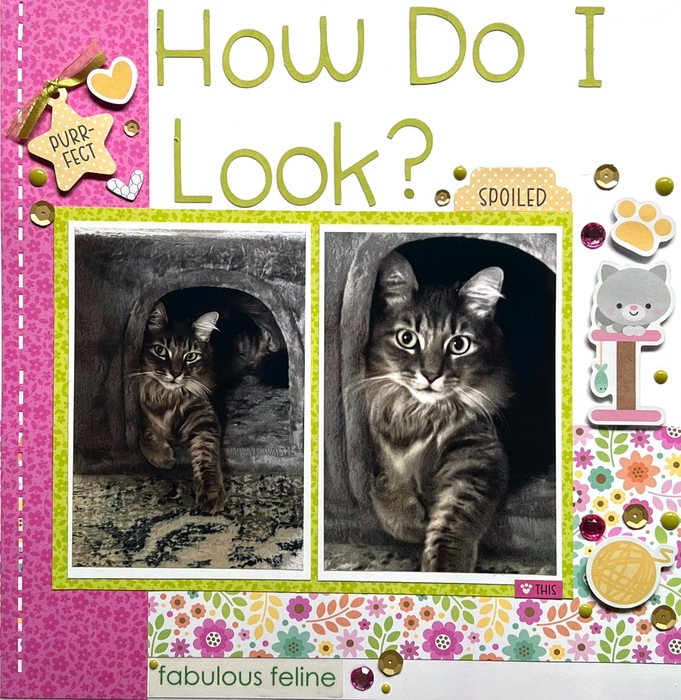
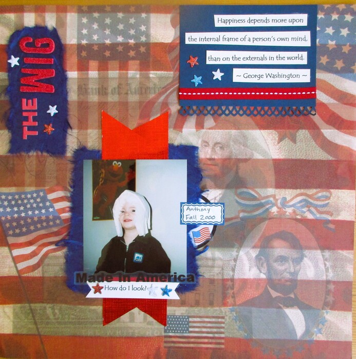
This is my last one, the quote How do I look?

Kim Breaux


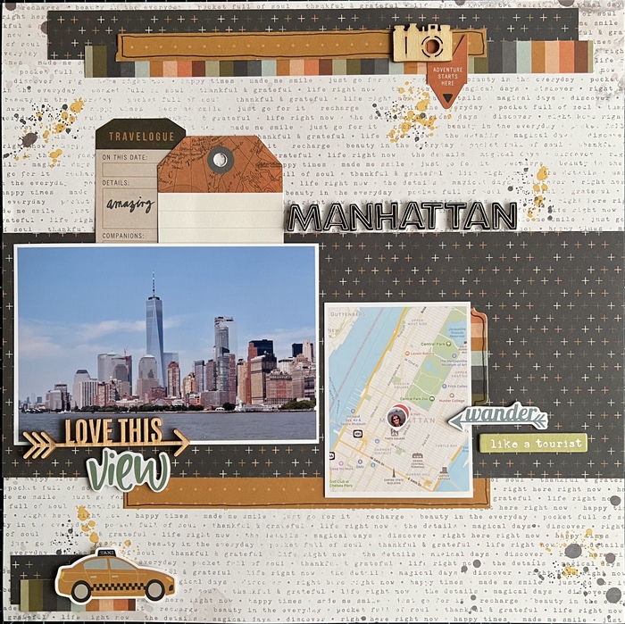
I went with option #3 on my layout, using the title Manhattan. Such a fun challenge, thank you!

Stacy





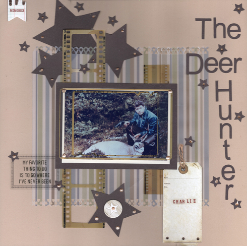
My late father in law was quite proud that he shot this buck with his pistol!!! I combined this with the Video Game Challenge - Option 2 Animal

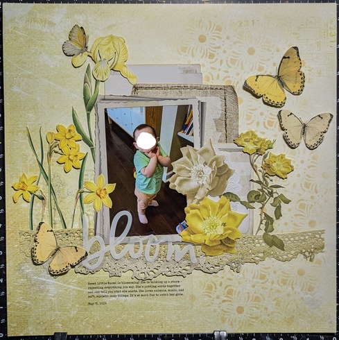
Option 1 - I chose the yellow background and slightly wonky single photo in the center of the Kramer VS Kramer poster as my inspiration, but dressed it up with 49 & Market goodness.


This was a fun one to do. I've had this paper FOREVAH and finally had a good use for it. This is DS in 2000 putting a diaper on his head LOL. I used the movie quote "How do I look?" It was perfect LOL!

Happy Scrapping!
Anne-Marie
Anne-Marie
Here's one from me using option 1. I think my inspiration from the movie poster "Postcards from the edge" is obvious: 
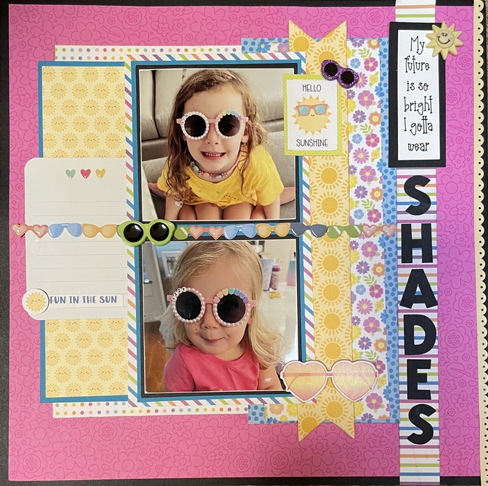
Shades

Shades
“The next best thing to the enjoyment of a good time, is the recollection of it.” — James Lendall Basford





I did option 2 using quote "How do I look?" My daughter took a stage makeup class and made herself look old. Used SBB Flasher's sketch.
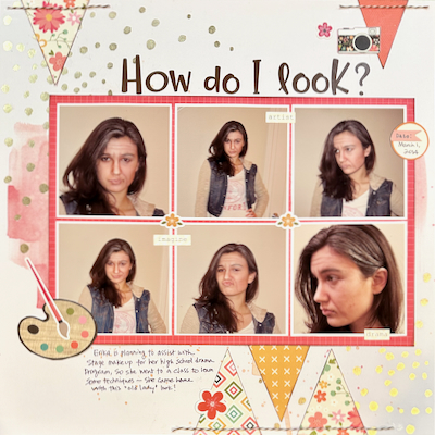





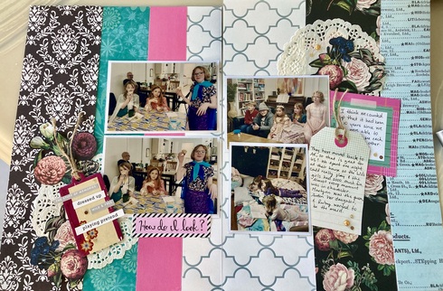
Option 2 How do I look?
<img src="https://sbing.com/i/gallery2/546655-490.jpg" alt="Image"/>
Layout created for the august Hollywoods finest movie challenge #1: inspiration from a movie poster - I’ve taken inspiration from the “mamma mia” poster, and flipped it upside down, so the arch has a downward curve.
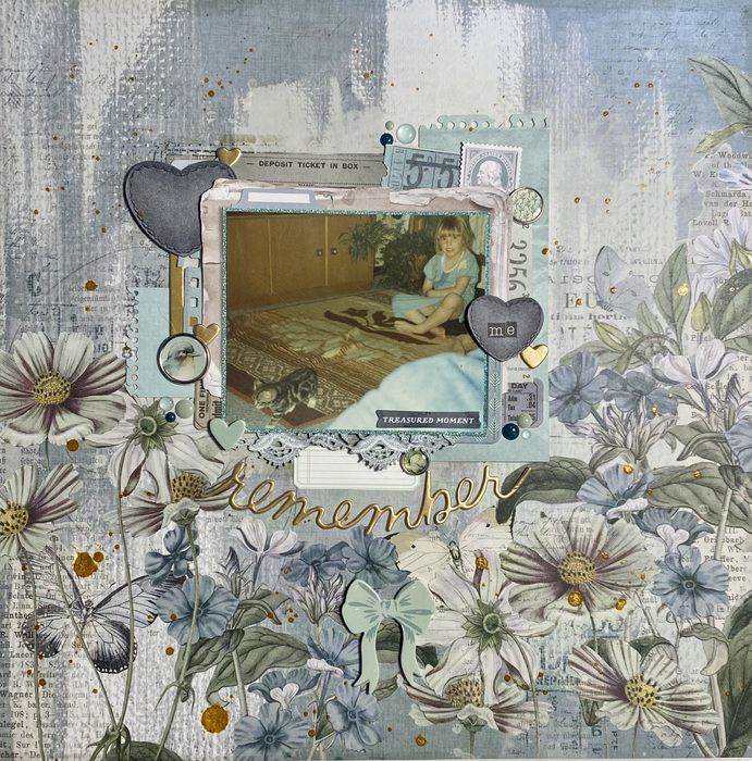
Total points for team Stinkerbelle: 13 (ACOT challenges [hollywood + 100 papers], upload, tile alpha, ribbon [lace below pic], enamel dots, label, border punch, speciality paper [photo mat glitter paper], chipboard [frames], something old: puffy title, something new: foam bow, wordy bits).
Add some sparkle to your life 
- Henriette

- Henriette

Information
Moderators


