My inspiration was the Toasted Box. I was drawn to the circles and the wave pattern.

Inspired by:
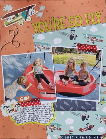
I put my teal pp at an angle like the green part of the ad. All capital font, and used a similar color scheme. Also used two square photos, which I overlapped and put at angles like the cheezits on the box. Also, this layout is about my favorite "duo," my baby girls!
Last edited by lilkoala3 on Sun May 26, 2024 9:34 pm, edited 1 time in total.
Leslie
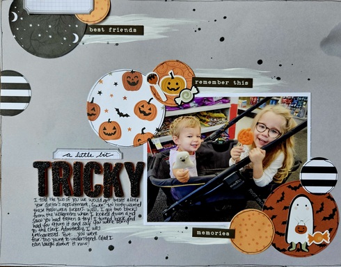
I was inspired by the brush strokes coming from the 3 round crackers with the names on them!
Leslie
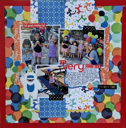
Inspired by the M&Ms, I thought this PP looked so similar to the M@Ms in the jar! And of course, my layout has sweets on it!
Leslie
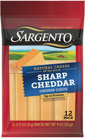
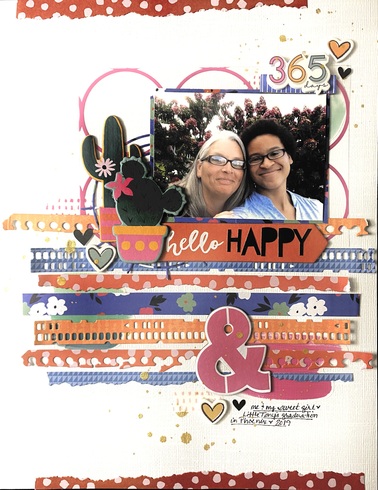
i was inspired by the colors, although i turned the reddish into pink and the yellow into an orangey color, the cheese in stick form inspired the strips of paper, the gold swooshy things on the black product name banner inspired the gold splatter and the black name banner inspired the black alphas 


*Stacy*



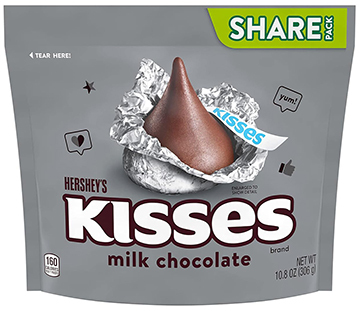
I was inspired by the Hershey Kisses ad - large central image with a large title below and small subtitle below that.
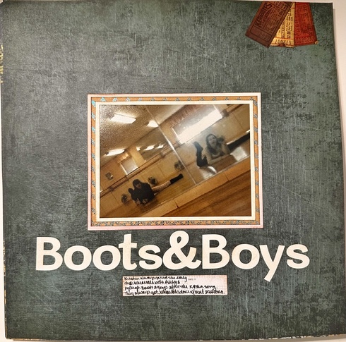


I chose the UTZ chips for my inspiration. I used the colors and I used my corrugating tool on the gold papers to mimic the ripples on the chips.
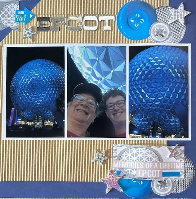


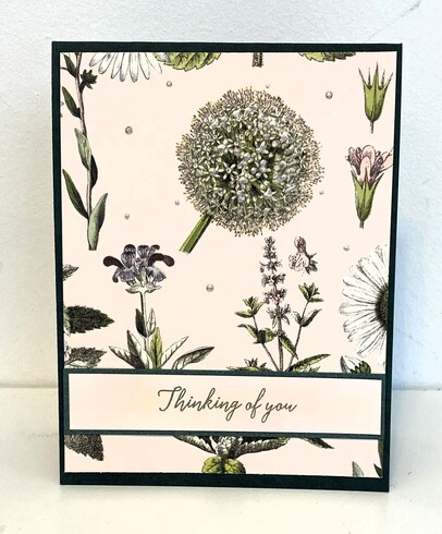
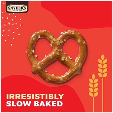
I was inspired by the Snyder's pretzel ad. The salt on the pretzel made me think of adding Liquid Pearls to my flower, which was the focal point of the card (similar to the pretzel). I hope you can see the liquid pearls in the photo. I also have the pearls sprinkled around. Also, I put the sentiment on the bottom. My pp has leaves on it as well.


Mary Love is all around you.



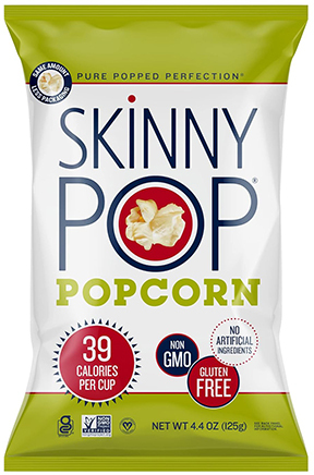
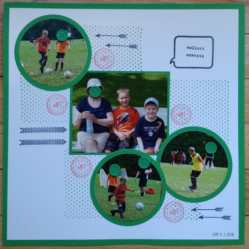
I chose the skinny pop popcorn bag for inspiration. I was inspired by the circles and the tall skinny font. I also used a lot of green in my LO!
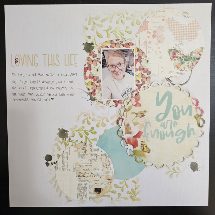
combined with grab 5

combined with grab 5
I used the Toasteds packaging, this is a great challenge! I'm looking at everything in my pantry differently now LOL
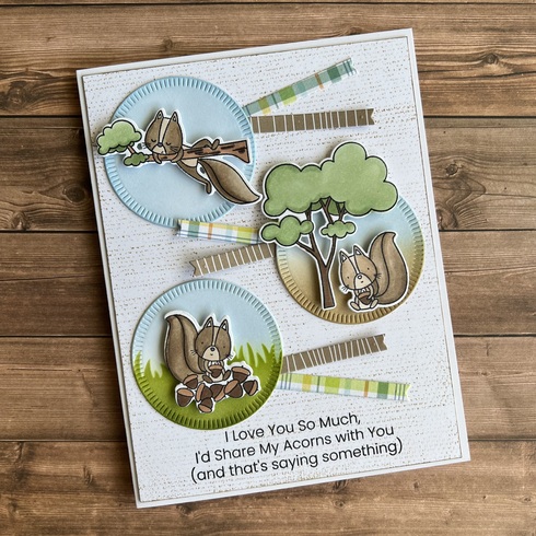

Stacy


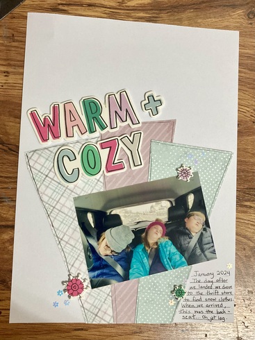
I scraplifted nellie-pickles and used the pistachios ad as well.
<img src="https://sbing.com/i/gallery2/546655-490.jpg" alt="Image"/>
I chose Toasteds (3 round crackers and placement of crackers, title centered at top and colors.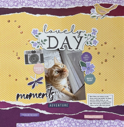

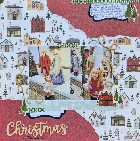
I ripped my paper to copy the design, title placement the same, added a label at the top, and I twisted the jute to look kind of like pretzels! Proud of this one!
Leslie
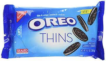
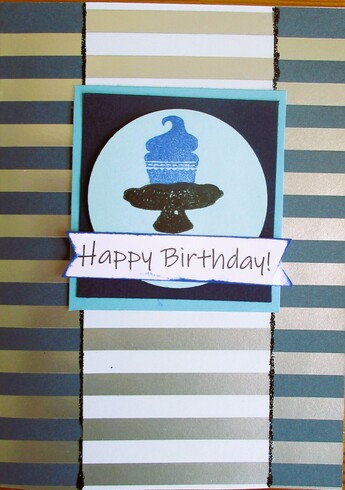
I used the Oreos packaging - the blue, white/silver/black colors and the thin cookies looked like stripes 


Happy Scrapping!
Anne-Marie
Anne-Marie
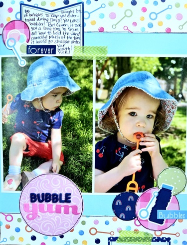
Followed the layout of the bag pretty closely! Also, my bubble theme was inspired by the "pop."
Leslie
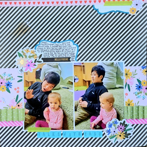
Not gonna lie - I totally scraplifted this idea from Nellie_Pickles. I accordian folded the green paper. Also used striped background paper because I thought it looked like ridges. Last, included a little tab/tag anchored to the top the page.
Leslie
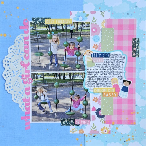
Inspired by the tagline, "What a girl can do" from the box. Very girl-centric topic and page, too.
Leslie
Information
Moderators


