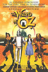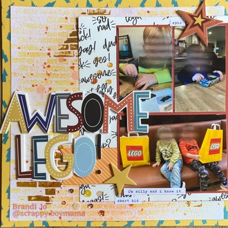
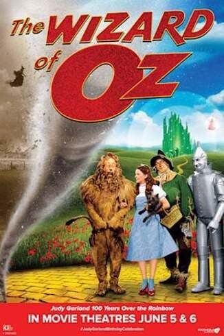
Here's my layout! I was inspired by the yellow brick road (stenciled my background), the alignment of the characters on the right of the poster (photos shifted far right), the large & bold title, and for the twister, I went with a very heavily misted background coupled with some lightning bolt patterned paper! this one was fun! i'll share the poster I picked too
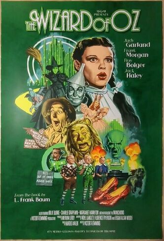
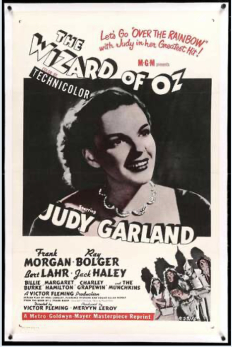
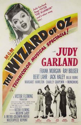
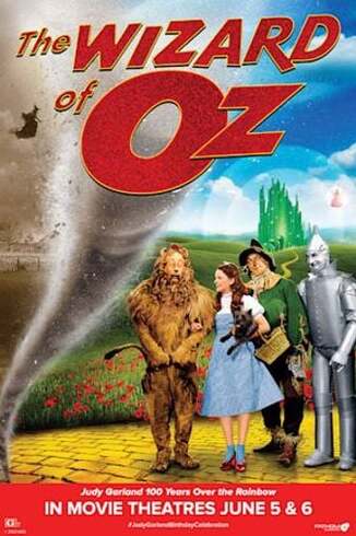
I was inspired by this poster:
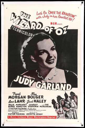
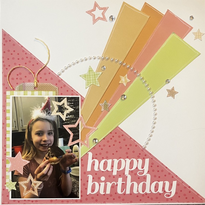
I used the pastel colors of the rainbow and the white space. I also noticed stars around Judy Garlands top photo and used star die cuts on my layout.
I tried to mimic the tornado, also with them sleeping like Dorothy when she was knocked out….
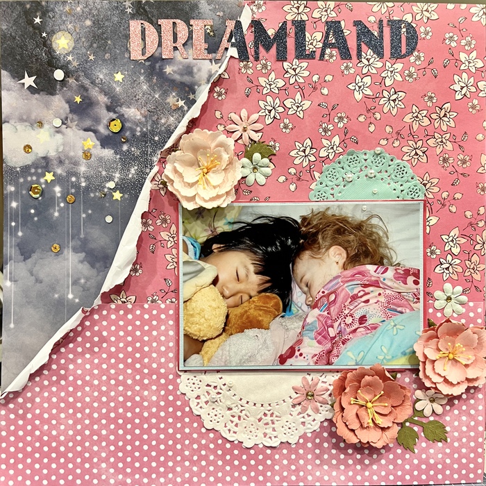
I used this poster as inspiration:
I loved the colors & the use of a mixed font for the title.
Here’s my layout:
I loved the colors & the use of a mixed font for the title.
Here’s my layout:
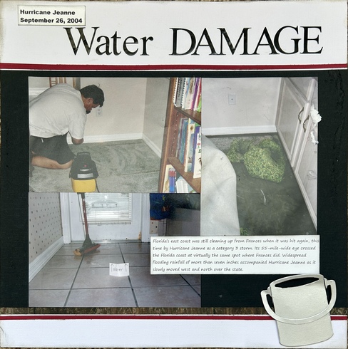
The whole layout is mimicking the poster with the angle of the water bucket and the figures at the bottom and the black on the SIDES! I "aged" the sides with black soot ink and distressed the papers some, and bold title. Red strip at top and bottom.
Here's mine:
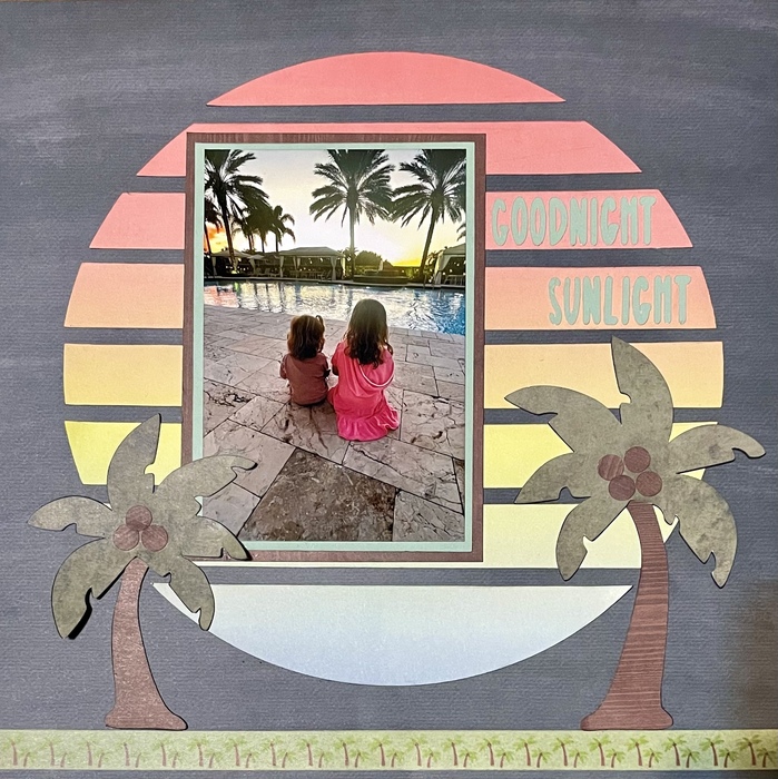
Goodnight Sunlight
My inspiration was this poster:
I loved the idea of the sunset and the orange/yellow colors immediately made me think of this sunset picture of my 2 DGDs. The shadows cast by the characters reminded me of the shadows cast on the pool water by the palm trees in the photo. My original idea was to use an ombre orange background, but then I spotted the circular rainbow-colored ring behind the Emerald City. This inspired me to create a rainbow circle behind my photo. I love how it came out and I am thankful for this inspiration!
“The next best thing to the enjoyment of a good time, is the recollection of it.” — James Lendall Basford
I found a lot to inspire me in this poster...
I took the dark monotone look for my background, the tall thin white font for my title, the 2 circular elements on the left side, and i dry brushed some white gesso under the edges of my main photo cluster to mimic the white "halo" you can see around the images on the poster.
Layout created for Kristin’s Wizard of Oz Poster challenge. I was inspired by the general layout of the poster, it fit perfectly with my very large picture.
Add some sparkle to your life
- Henriette
- Henriette
I have a bunch of pictures from visiting The Land of Oz in Beech Mountain, NC. Have you been? I was hoping to get more of your challenges done, but I'll have to do it as a rewind or save for another day. Thanks for the fun games and challenges.
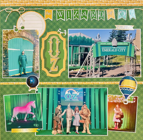
I used this poster as inspiration. Because of the greenness, I pulled out all of my Emerald City photos and did it on a green background. Ok, so that's only one color, but I did also use the title, the characters, and yellow brick road -- so I hope this counts.
My layout:
I used this poster as inspiration. Because of the greenness, I pulled out all of my Emerald City photos and did it on a green background. Ok, so that's only one color, but I did also use the title, the characters, and yellow brick road -- so I hope this counts.
My layout:
I used this poster.
I used green background with white lettering, a couple other shades of green. A boot in place of the red slippers on the poster.
Retired, scrapping and happy!
Sherri
Sherri
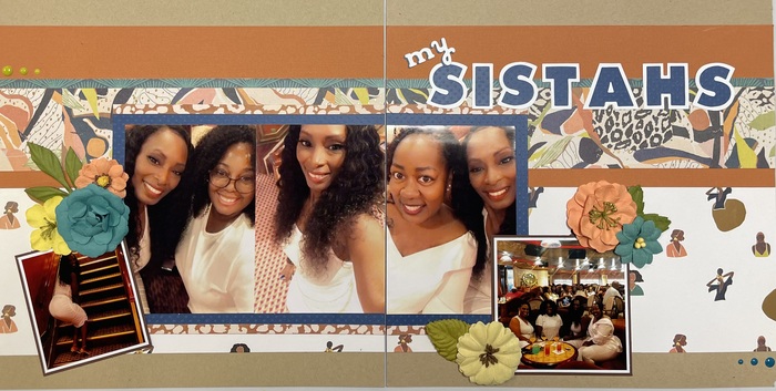
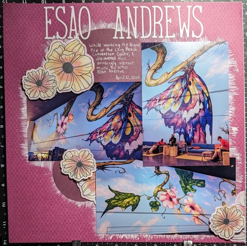
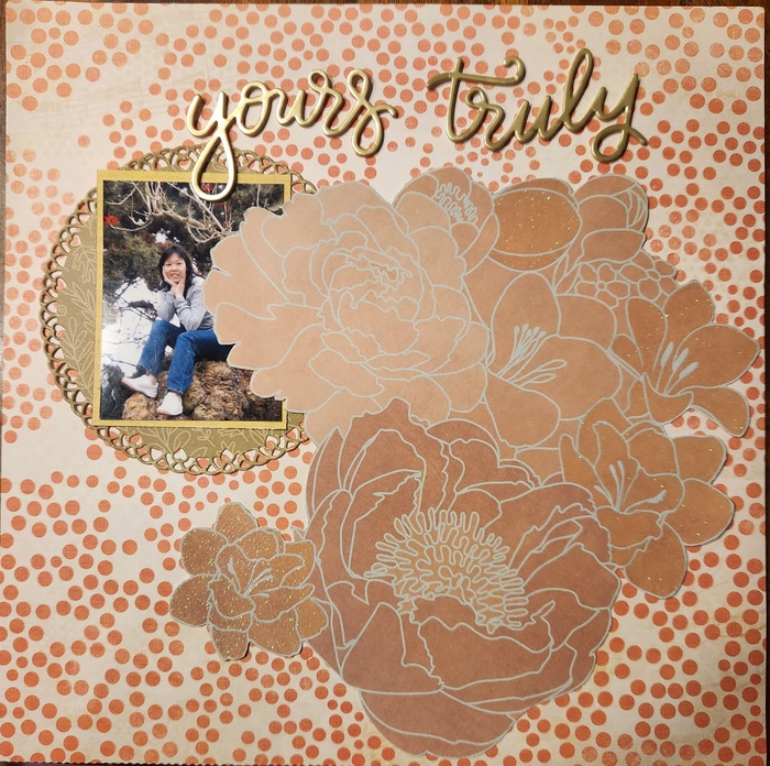
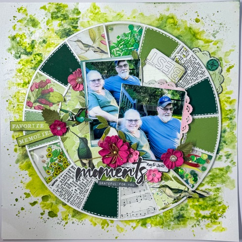
I used the below as my inspiration for the layout. I added the title to the top of my page, I have a circle just like the poster and I fussy cut out the large flowers to mimic the large characters on the Wizard of Oz poster.
My layout inspired by this challenge.
I was inspired by the predominantly green coloring and the
circle encompassing the castle.
there were other elements as well. Great challenge!
I was inspired by the predominantly green coloring and the
circle encompassing the castle.
there were other elements as well. Great challenge!
Have a Wonderful Day! ~Misty
I have not been and had not even heard of it but will definitely be checking it out. Thanks for sharinghsblair wrote: ↑Fri May 17, 2024 9:29 pmI have a bunch of pictures from visiting The Land of Oz in Beech Mountain, NC. Have you been? I was hoping to get more of your challenges done, but I'll have to do it as a rewind or save for another day. Thanks for the fun games and challenges.
I used this poster as inspiration. Because of the greenness, I pulled out all of my Emerald City photos and did it on a green background. Ok, so that's only one color, but I did also use the title, the characters, and yellow brick road -- so I hope this counts.
My layout:
Kristin
"Be the Change You Wish to See in the World"
Thanks for participating, wanted to leave you some gallery love but cannot find it in your gallery. Love your take on the challenge and those amazing big fussy cut flowers. Love that you added the circle too.scraphappylife wrote: ↑Fri May 17, 2024 11:07 pm
I used the below as my inspiration for the layout. I added the title to the top of my page, I have a circle just like the poster and I fussy cut out the large flowers to mimic the large characters on the Wizard of Oz poster.
Kristin
"Be the Change You Wish to See in the World"
Winner in Opening Post
Kristin
"Be the Change You Wish to See in the World"
Congrats! I agree this was the hardest challlenylge for me!
Information
Moderators