I kind of get that this is only for paper, but digi has some ugly papers in the stash, too. lol I often buy digi "kits" for certain things in them, but some of the papers are hideous. lol I don't use them, but for some reason, I don't delete them, either! 
Laura


Great challenge and a great way to use up those ugly papers that we pass by again and again.
Jill
Jill

Jill


Art_Teacher wrote: ↑Sat May 04, 2019 11:13 amI kind of get that this is only for paper, but digi has some ugly papers in the stash, too. lol I often buy digi "kits" for certain things in them, but some of the papers are hideous. lol I don't use them, but for some reason, I don't delete them, either!
I do that too! I guess I think my taste will change or suddenly I'll find them appealing. lol
Jill
Jill


Jill


These are my ugly papers. They really aren't that bad, but I've had both for years and always skip over them!

- Jillian
Art_Teacher wrote: ↑Sat May 04, 2019 11:13 amI kind of get that this is only for paper, but digi has some ugly papers in the stash, too. lol I often buy digi "kits" for certain things in them, but some of the papers are hideous. lol I don't use them, but for some reason, I don't delete them, either!
Sorry i didn't realize how digi comes like that too! If you - or anyone - wants to join in with a digi project that is fine!
Edited my rules again.
Karrie


emmapaige wrote: ↑Fri May 03, 2019 2:49 pmI'm going to attempt to use these papers from 2008. Wow has my taste changed in the last 11 years!
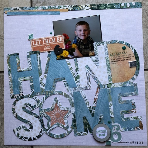
I'm back with the layout I did using those two papers. My solution for the ugly papers was to cut them into 4x4 pieces and cover most of them with pictures of a cute kid (my grandson, Cole). LOL!!
First of all, yes, I agree, those papers really were UGLY...but wow, did you layout change all of that! Great job and thanks for the ideas.
It really does look fabulous! It makes the letters really pop and all of a sudden, it isn't too ugly any more
Hmm . . . I hadn't planned on doing this challenge because I'm just Digi Scrapping this weekend but with the rule change I will give it a go. That will mean some major editing of those patterns.
Dawn Marie
Well here is my digital Ugly Paper layout.
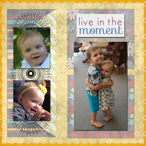
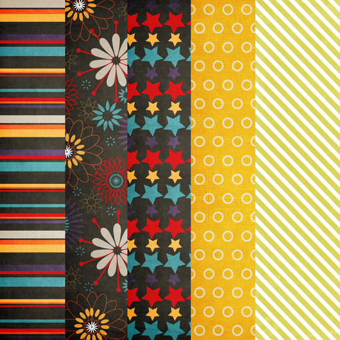


Dawn Marie
The fussy cutting really changed the look of that paper! Nice LO!
Here are my "ugly papers"
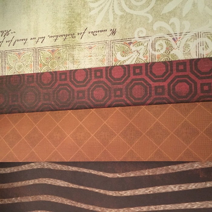
These are from a pack I bought for my first big scrapbook project. These *really* aren't my style anymore!
And here's the LO:
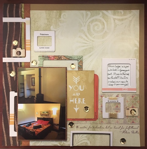
I used the MH frames to modern it up a bit.
The green strip is the backside of the main background paper.
I'm starting to think that there are too many sequins...

These are from a pack I bought for my first big scrapbook project. These *really* aren't my style anymore!
And here's the LO:

I used the MH frames to modern it up a bit.
The green strip is the backside of the main background paper.
I'm starting to think that there are too many sequins...
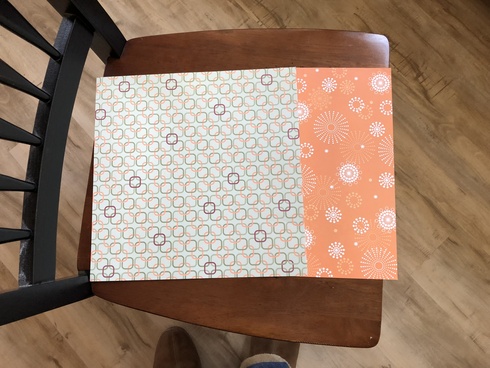
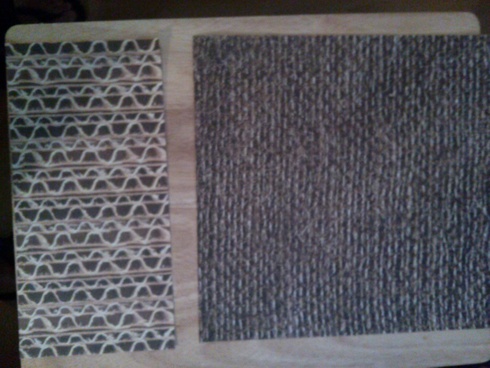
I have a lot of ugly paper but am loathe to toss it. I mean someone might like it eventually. lol The orange is 6x6. The green squares is 12x3
Layout is of my DD and oldest grandson in the Gold Rush Museum in Coloma, CA back when DGS was only 8. He was tolerating the museum till it was time to actually pan for gold. He loved panning and was excited he got a few miniscule flakes.
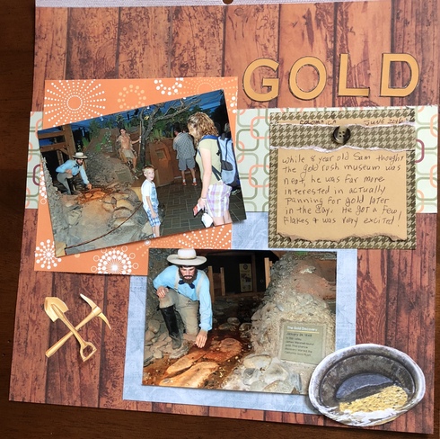
Layout is of my DD and oldest grandson in the Gold Rush Museum in Coloma, CA back when DGS was only 8. He was tolerating the museum till it was time to actually pan for gold. He loved panning and was excited he got a few miniscule flakes.


 Charleneanne https://sbing.com/i/gallery2/481754-700.jpg
I actually like the way this came out! I hated the papers before and would have never used those busy colors, but layering helped make the patterns work better.
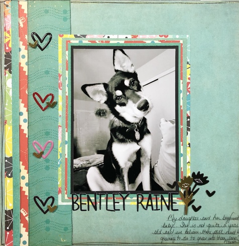


Jan G.
This challenge is awesome! I love everyone’s work! I’m really inspired!
Here are my ugly papers. They came from an ACOT designer's collab kit from back when ACOT had digi designers. Problem with most collab kits is that there are a bunch of papers and elements you would never use and they don't always really go together. All the designers had the same color scheme and theme, but that's all that connects them. These are some of the papers I have never used, mostly because I hate the colors and the patterns are sort of obnoxious. I not only used them, but changed the theme from the kit (it was Harvest Haze) and made it Christmas!
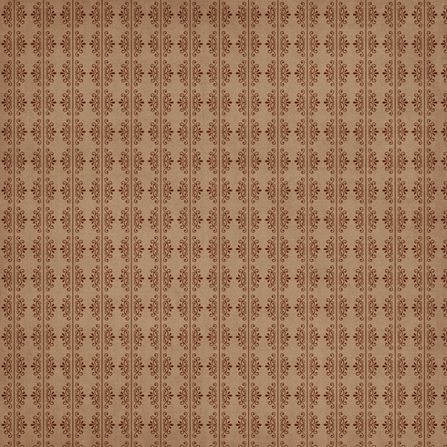
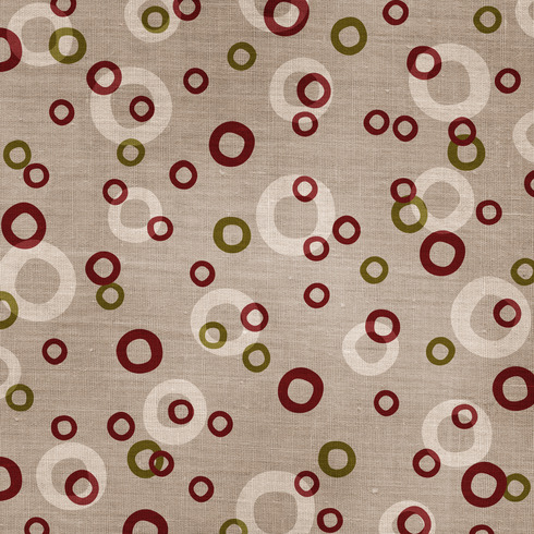
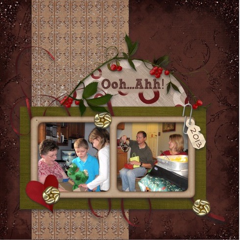
For my layout, I cut the papers down, I used "chalking" to cover most of the circle paper, and I thought the red circles went well with the loopy ribbon. For the tan, patterned paper, I used a digi technique called "plastic wrap" to tone down the pattern., and the green is okay as a photo matte, because you don't see much of it. lol I actually like how this turned out!


For my layout, I cut the papers down, I used "chalking" to cover most of the circle paper, and I thought the red circles went well with the loopy ribbon. For the tan, patterned paper, I used a digi technique called "plastic wrap" to tone down the pattern., and the green is okay as a photo matte, because you don't see much of it. lol I actually like how this turned out!
Laura


Reminder - this challenge is open until Saturday midnight for sprinkles and iNSD award, and open till the end of the month for a $5 GC!
Karrie


Here's my two PPs - older Scenic Route "Roxbury-Dearborne Street". I cut one into a 6" circle and will used the red with stars as the background.

Emery's "1st Celebrity Crush" - Colorado AVS Mascot Bernie
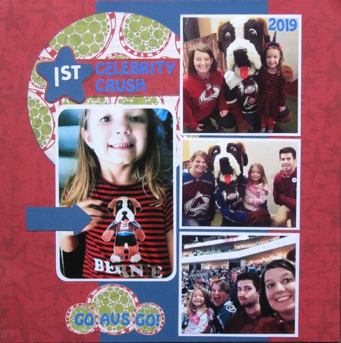

Emery's "1st Celebrity Crush" - Colorado AVS Mascot Bernie

blfonty a.k.a. Bonnie


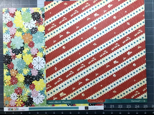
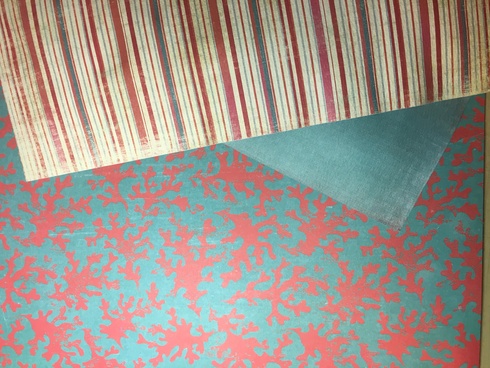
Here's my ugly paper.
The teal and red one. It came in a beach paper pad, so I think it's supposed to be a coral pattern. All the other paper in the pad was normal. I've used almost all of it, but didn't think I'd ever use this one. Thanks for the inspiration!
Here's my layout
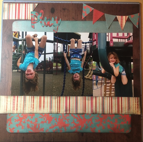
The teal and red one. It came in a beach paper pad, so I think it's supposed to be a coral pattern. All the other paper in the pad was normal. I've used almost all of it, but didn't think I'd ever use this one. Thanks for the inspiration!

Here's my layout

Jill
Jill


Jill


Reminder - this challenge is CLOSED for sprinkles and iNSD award, but open till the end of the month for a $5 GC from all participants (yes can win again)!
iNSD points winners as follows:
random.org # 5 = Karen C. for 600 points
1st entrant = lissahope26 for 25 points
all entrants = 30 points (unless missed the rules)
contributing ugly ppr evn tho didn't do a LO lol = tms58 5 points
contributing positivity for other's work = Machmuses & Lizzi97 for 5 points
contributing ideas to the challenge = MTCanuck & Art_Teacher for 5 points
entering all 3 of my iNSD challenges = blbabe1234, lissahope26, Art_Teacher, emmapaige for 100 points
Karrie


Information
Moderators


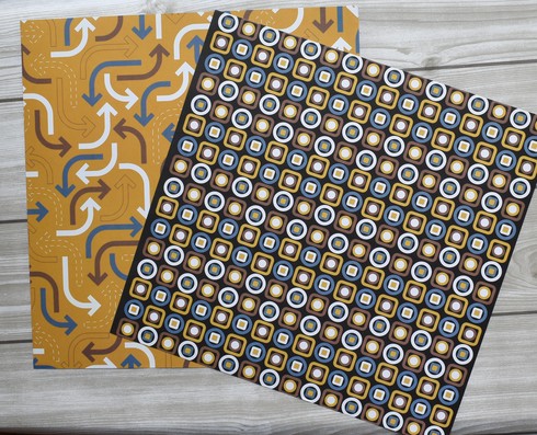
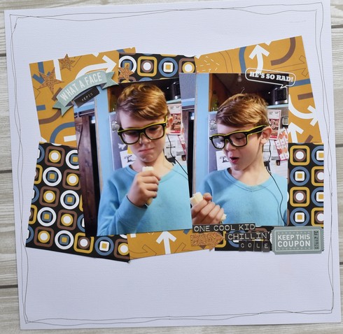
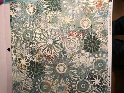

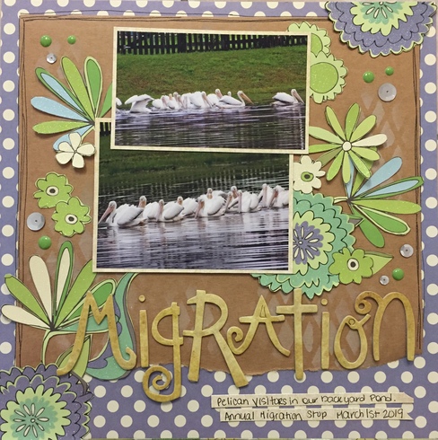
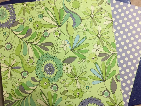

 This is my ugly paper. and this is my finished layout.