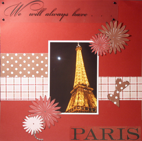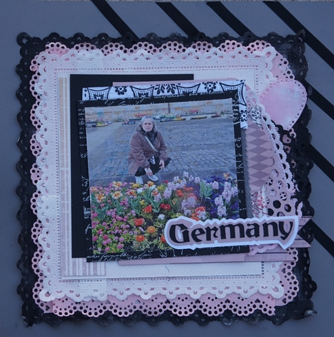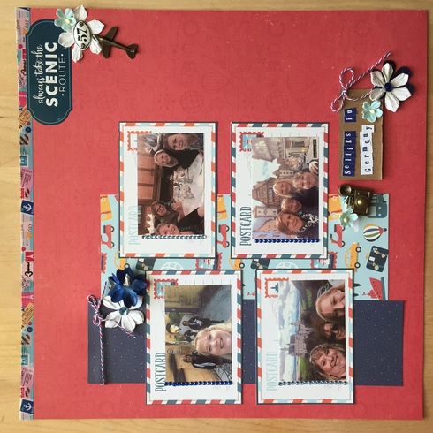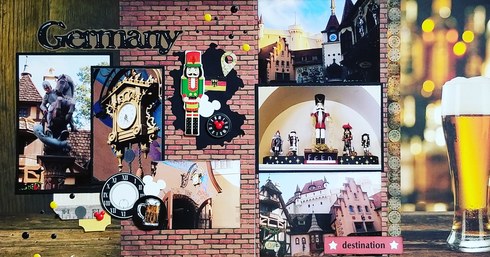
I love Louise's (traveler) European layouts. Here is one:

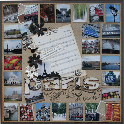
I love this layout by VeronicaH because all the small photos give an overall feeling of the city... I take a lot of photos when I travel, and there are always a bunch that don't have a story or don't need their own page, but that remind me how the place feeled... I like seeing the different colours, architecture styles, shop windows, and all the 'ordinary' things that a new place has...
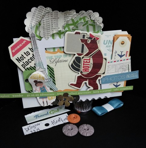
I love this card by Alicia because of how she layered in so many embellishments... It sums up all the hustle and paperwork and documents of travelling... Even though so much is done online now, there's still something exciting about tickets and luggage tags and passport stamps... Travel changes so quickly, so documenting how you travel is just as important as documenting the destination...
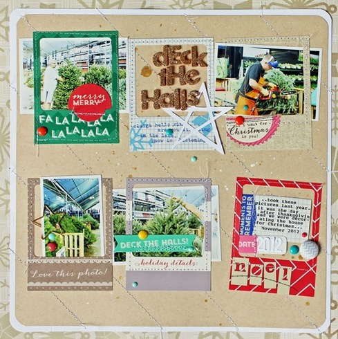
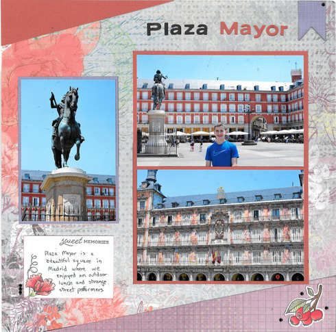
This layout by Kristin isn't travel themed, but I love how she used frames and embellished and documented on each of them... I think it would be a great way to show highlights of a day, or to show different views of the same tourist attraction... I also really like how she put the title in one frame, and journalling in another...
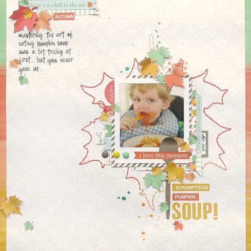
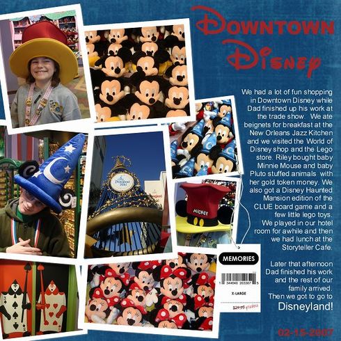
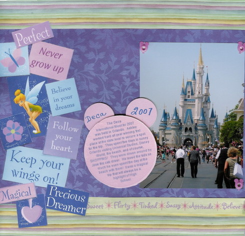
This layoutalso isn't travel themed, but I love how Michelle stitched a large leaf - a symbol of the season, as the grounding element for her photo... I think that could be great for a travel layout... Choose an icon or symbol of the place where you are, and use it to ground a photo... Stitching, or stencilling, or cutting something out with a Silhouette would all work... Perhaps the outline of Mickey's head and ears, or the Disney castle... You could even use the three letter short form for the country or even the three letter airport code...
[
Donna-Retiree3-Proud Grandmother of Three Boys!
[highlight=#000000][/highlight]
Donna-Retiree3-Proud Grandmother of Three Boys!
[highlight=#000000][/highlight]
Information
Moderators


