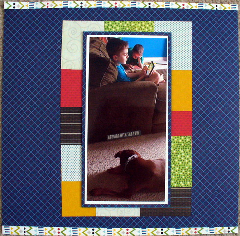
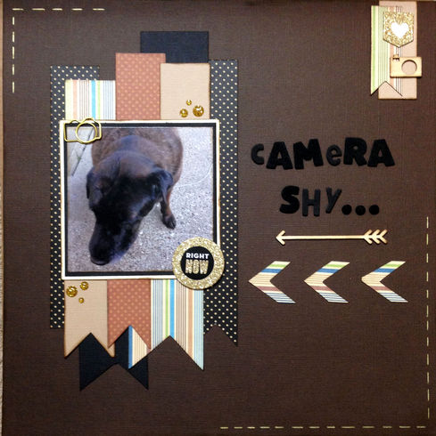
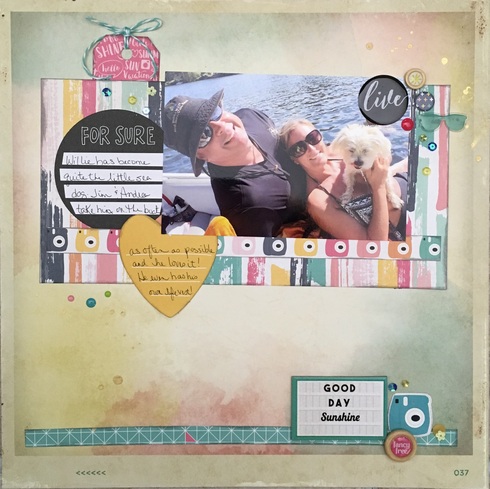
You did it right - it's about the dog, since she's in the picture, but you used other papers!! I love the central photo, and your choice of colors!! Great job, and thanks for playing along!mrozwood wrote:I hope it's ok that the page isn't about the dog, but she is in the pic.
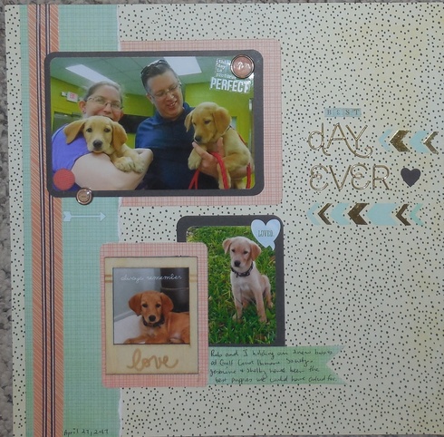
I saw this on the website too, for their challenge! I loved the soft spring colors you chose and the love comes off that page!! Thanks for making it part of my challenge too, Brandy!!
hey Sher, so very sorry for your loss and I hope you're feeling a bit better these days.
Here is my page, scrapped about my pet, but not a "pet" supply in sight! The embelli stuff I used was from a valentine line!
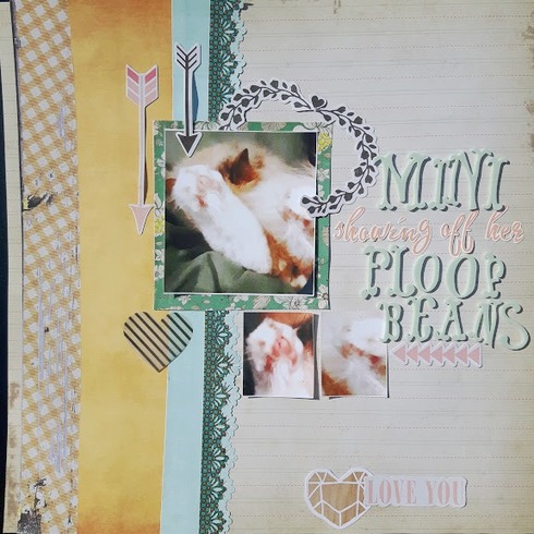
It's called Floof Beans - A hilarious name to call a cat's furry toe pads that I saw online. I just had to snap this pic of Mini sleeping practically folded in half and sticking her leg way out.
I also used that Sketch N Scrap sketch!

Karrie


That's hysterical!! I love that name for their furry paws!!! And the layout is simply wonderful - and I'm finding, too, that Valentine stuff works great on a lot of layouts!! Thanks for doing my challenge!!sweetsour wrote:hey Sher, so very sorry for your loss and I hope you're feeling a bit better these days.
Here is my page, scrapped about my pet, but not a "pet" supply in sight! The embelli stuff I used was from a valentine line!
It's called Floof Beans - A hilarious name to call a cat's furry toe pads that I saw online. I just had to snap this pic of Mini sleeping practically folded in half and sticking her leg way out.
I also used that Sketch N Scrap sketch!
Here's mine for option 1
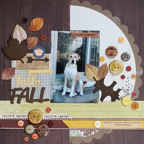

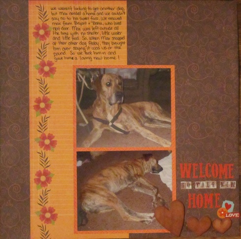
Here is my LO about getting the Max dog using fall papers from Echo Park
Em
My blog

My blog

here is mine
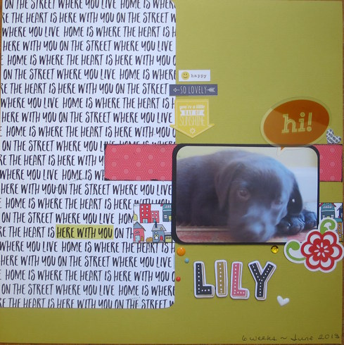

Ann ~ Life is always better at the beach!


view my blog (new) https://ourhideawayparadise.blogspot.com/


view my blog (new) https://ourhideawayparadise.blogspot.com/
I used the first option - a layout about a pet but no pet/animal products on the page.

Here is my submission for Option #1. Auggie's day at Coors Field for Bark at the Park.
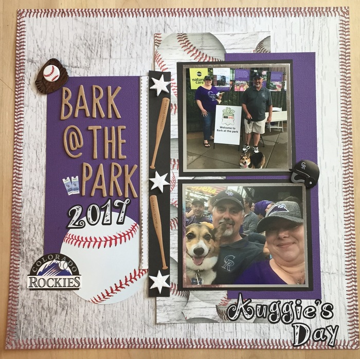
I do not know why this is SO Large !!! I did what I always do and I tried it 3 times now !

 Guess you have to see the whole picture in the gallery ! Sorry

I do not know why this is SO Large !!! I did what I always do and I tried it 3 times now !


 Guess you have to see the whole picture in the gallery ! Sorry



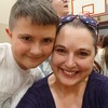
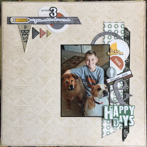
Here's one from me, thanks for the fun challenge! I chose the first option, using boy themed Pinkfresh Studios papers for my pet pic (hope it's ok there's a human in there, too LOL). Also combining with the Sept. Manufacturer challenge & it's my sample for my October Cherry Lift challenge.

Stacy



Information
Moderators


