Hello and welcome to my 5 Details to Make Your Pages and Cards POP!
DISCLAIMER- I am sure that some of these things will not be new to everyone but hopefully everyone can take something away from my class....
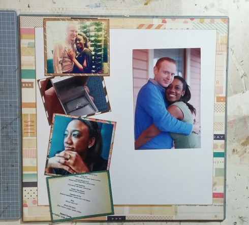
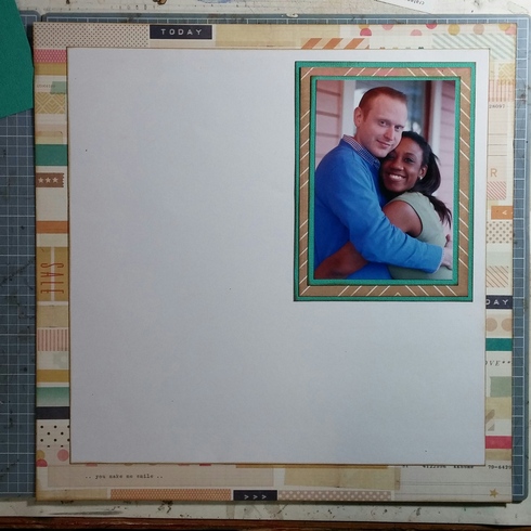
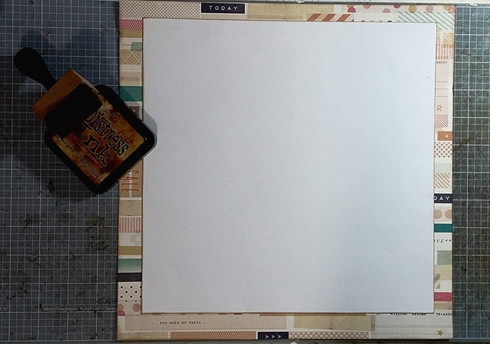
Start by choosing a busy paper to be your background paper. I chose Thrifty from Crate's Craft Market line. Cut a square out of the middle of the page and set it aside for layering later on..
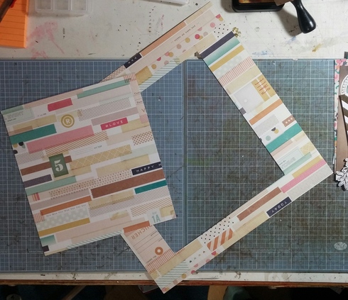
The square I cut is somewhere around 8X8- I definitely did not measure...just guessed and cut.
Choose a solid or small printed paper (I chose white) Cut it to 10 ½ inches X 101/2 inches...you'll need to measure this one...
And here is my first detail to share
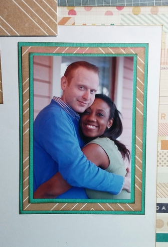
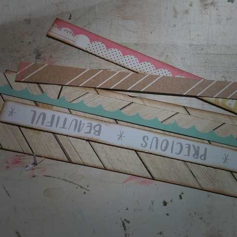
DETAIL #1- INK EVERY LAYER,EVERY TIME. Find an ink you like (I used Tim Holtz Vintage Photo- but there are tons to choose from. Another great one is ColorBox Chestnut Roan Chalk Ink) and use it on every layer of paper on your layout. Even if you aren't going for a “distress” look. In my opinion, ink provides some continuity between layers and some shadows, so the layers will flow together well.
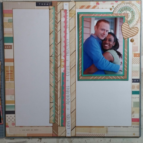
So ink up both of your papers and layer them together..like this..
Alternative- If you don't have ink, mat all your layers very thinly with a white, kraft, or black cardstock.
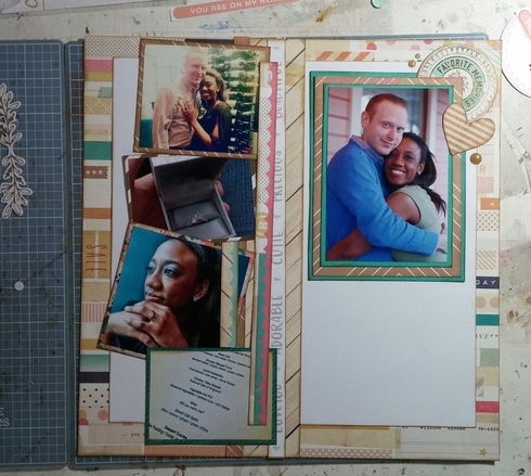
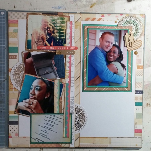
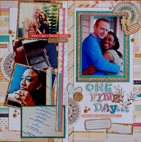
Look at your photos. Choose one to be the “focal” photo and set it aside- we will work on it for the next step. Crop the rest of your photos and mat them with a paper of your choice, inking your edges as you go. (You can skip the ink here if you don't have any) How you crop your photos depends on how many you have- crop them so they will fit down one side of your page- similar to a border. They can be smaller then that but not larger...any questions, ask in the Class Chat thread.