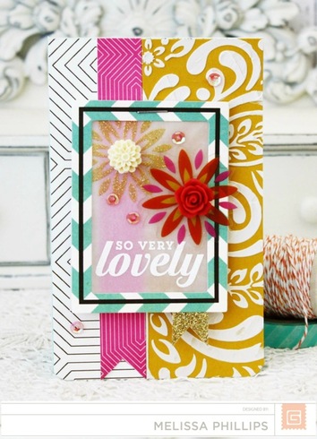
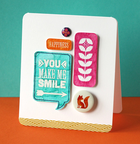
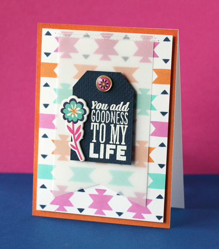
This is definitely not one of my favorites for them http://www.acherryontop.com/shop/compan ... and_bazaar
I like the colors and some of the B-sides but it's not a favorite of mine either.
I like the colors, too, but all together, they seem a bit much. I think I would have a hard time using most of them because they are so bright, they would overwhelm my photos.
Laura


they seem to really like the whole far east type stuff...which is fine for some im sure...but I cant think of one thing I would have that goes with this stuff 
Basic Grey is usually my main go to manufacturer. But, this one has me scratching my head a little. I love bright colors, but the mix of these seems a bit much.
OCD is not an adjective. It is not a personality quirk. It is not synonymous with being organized. It is a complex and debilitating mental health illness that affects people of all ages and walks of life, and is defined by the presence of unwanted, intrusive thoughts and repetitive actions.  I am an OCD warrior and I fight for my son.


I used to LOVE Basic Grey but lately I haven't been a fan. This one doesn't reach out to me either! 

I am sorry but that collection is way to wild for me! I like a little basic grey mostly there travel collection and capture collection.


Definitely not my fav either! I think the alphabet sheet was the only thing that I really liked.
Susan

Ya know, with all this brightness and vivid color, it could be a great line to use with white gesso over it to mute the colors but still get color. Also may be fun if you are leaving a lot of white space, can use for that pop of color or small amounts of color with monochromatic pages. Just a thought?
For the most part, Basic Grey has always been about their solid-ish, distressed papers, usually on the B side for me. I love those.
The A side of Hagia Sophia would be the hardest paper for me to use. Personally, I don't care for it and the scale of the design Is so large.
http://www.acherryontop.com/shop/search ... aar/189526
The A side of Hagia Sophia would be the hardest paper for me to use. Personally, I don't care for it and the scale of the design Is so large.
http://www.acherryontop.com/shop/search ... aar/189526
I'm not a fan of this line, either. I love bright, vivid colors, but I don't really like the style of the prints.
~~~~~~~~~~~
Christi_S
Totals for 2016
Layouts 33
Cards 42
Totals for 2015
Layouts 299, Cards 331, Mini Books 5
Christi_S
Totals for 2016
Layouts 33
Cards 42
Totals for 2015
Layouts 299, Cards 331, Mini Books 5
I agree! I LOVE BG and have a pretty large stash here...BUT....I can pass on this line and not feel bad at all..I do like the cute little fox but the rest is just tooo bright and wild..and I love colors and mixing and matching uncommon ones together.

I agree, this would be pretty with a white or light grey background, and could look really nice. but for me, it's like I'd be forced to have to use it if I had it, it's just not something that screams to me "gotta have this!" or anything. IF I had it, like if someone had given it to me or I won it, I'd be forced to try and do something with it, and a little here and there might not be bad. Otherwise, I think for me (and I'm guessing most ladies who have said they just don't care for it) it's that it just doesn't inspire me right away and off the top of my head, I just can't think of anything I'd want it for.jlparkmark wrote:Ya know, with all this brightness and vivid color, it could be a great line to use with white gesso over it to mute the colors but still get color. Also may be fun if you are leaving a lot of white space, can use for that pop of color or small amounts of color with monochromatic pages. Just a thought?
Carolyn, mommy to Olivia (precocious preschooler) and Owen (rambunctious toddler).
2013 Page Totals: April - 3. May - 17. June - 25. July - 20. Aug - 20, 2 tags. Sept - 5. Oct - 13. Nov - 8. Dec - 14 LO, 2 projects, 1 card.
Year: 125, 1 card, 2 projects, 2 tags
2014 Page Totals: Jan - 15, 2 cards. Feb - 9, 1 project. Mar - 21 (I was busy!) (45 this year already)

My New Blog! Scrapper, Interrupted
2013 Page Totals: April - 3. May - 17. June - 25. July - 20. Aug - 20, 2 tags. Sept - 5. Oct - 13. Nov - 8. Dec - 14 LO, 2 projects, 1 card.
Year: 125, 1 card, 2 projects, 2 tags
2014 Page Totals: Jan - 15, 2 cards. Feb - 9, 1 project. Mar - 21 (I was busy!) (45 this year already)

My New Blog! Scrapper, Interrupted
Not for me, either.
I love the idea of it. The colors are vibrant and they have the pops of purple. The little fox is super cute. I think it looks too similar to the Spice Market line they just had out.
~Amanda
Blog: http://www.craftymusician.blogspot.com
Blog: http://www.craftymusician.blogspot.com
I love the bright colors. And some of the designs.
Kimber
I used to be indecisive; now I'm not sure.
I used to be indecisive; now I'm not sure.
I might buy that stripe! Sometimes I need a stripe that has purple in it!! So I was excited to see some purple!!
- joannie


Information
Moderators


