Thank you everyone for all the participation! I loved all the wonderful quotes and the creativity that you all showed using quotation marks. Since I had 23 entries there will be two winners!
Winner #1, courtesy of random.org, is…
#13 butterfly843
Winner #2, courtesy of random.org, is…
# 3 sweetsour
Congratulations to both of you!! I will be sending you your gift cards shortly!
-------------------------------------------------------------------------------------------------------------
This month's Graphic Design Challenge is finally here Cherries! Since I am posting it so late I am going to be running this through March AND April.
This month is going to be about quotation marks. You've all seen pull quotes in magazine and newspaper articles. A pull quote is when a small quote is "pulled" from the body of an article or story, and set in larger text along the side or some place around or near the article itself. Many times when you see a pull quote the graphic designer exaggerates the quotation marks to draw you to the quote. It also breaks up the monotony of a lot of text on the page so the quotation marks and the pulled quote become a design element for the page itself. It can be a lot of fun to use those quotation marks in an artistic manner.
So this month's challenge is for you to use a quote somewhere on your layout, card, or project, and get creative with your quotation marks. You can use the quote as your title, or you can just "pull" the quote out of your journaling and put it larger anywhere on your page. You also may just use a quote somewhere on your page. It doesn't have to be from your journaling if you just want to use a quote. Make your quotation marks a different size from the text of your quote, and get creative with them.
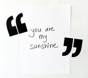
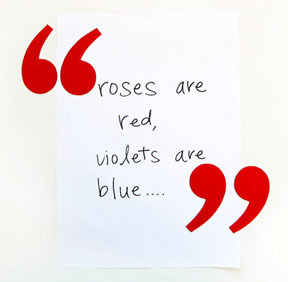
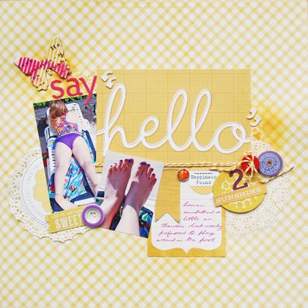
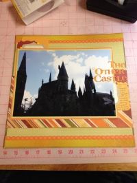
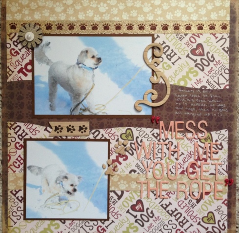
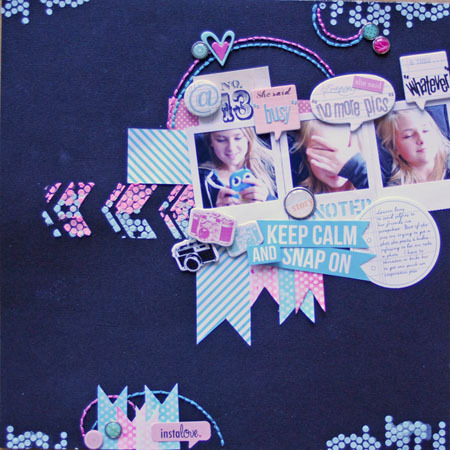
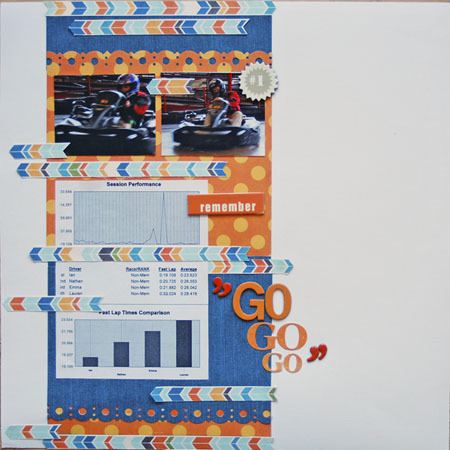
Here are some examples of quotation marks being used in a creative way. You can use them for inspiration.
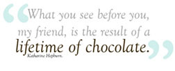
Keep in mind that you DO NOT have to use quotation marks that go with the font or alpha you are using. That is the fun of it, to get creative and find quotation marks that give your quote an artistic look.
Again remember that your quote DOES NOT have to be your title.
Open to paper, digi, hybrid, cards, crafts, or whatever this inspires you to create.
Multiple submissions are allowed.
May be combined with one other challenge if that challenge allows it.
This is running through all of March AND April. Please post it to this thread and add it to the gallery spot for the March/April Graphic Design Challenge by April 30th at 11:59 pm for a chance to be the random winner of a $5 ACOT gift card from me!
Most of all, have fun!
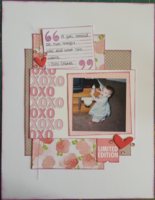
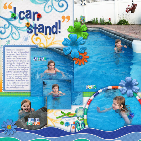
Here is my page. It is of Maddie last summer when she discovered that she could stand in the shallow end of the pool with her head above the water. My journaling reads: Maddie was so surprised when she went in the pool last summer and found that she could actually stand in the shallow end with her head above the water. She was so excited she yelled out “I can stand!” and we all were so surprised too! She had grown so much over that last year but this was something that none of us expected. Maddie thought it was great and had such a fun time being able to walk around in the water, and as she got more comfortable she started splashing around and pretending to swim.
I pulled out the quote of her saying "I can stand!" and used it for my title. I used large, chunky quotation marks and made them a different color from the alpha in my title. They are also not the same quotation marks that go with the alpha. I choose a font that had nice chunky quotes and used them.
Have fun! I can't wait to see what you all come up with!
Participants:
1) Tammey
2) Deanna13
3) sweetsour
4) Yankeegirl
5) ScrappininAK
6) Steakgoddess
7) mgehrke
8) scrappininAK
9) scrappininAK
10) scrappinmom99
11) scrapsteph
12) sweetsour
13) butterfly843
14) Sarah_M.
15) oceanbreezes423
16) Craftyshannon
17) christinec68
18) jrrah4903
19) blbabe1234
20) ScrappyDistractions
21) blfonty
22) sandi0805
23) Christy_S
24) ajmaluck
Last edited by pawprints on Fri May 02, 2014 6:33 pm, edited 25 times in total.
Great idea, thanks for the inspiration. Love your example!
Carolyn, mommy to Olivia (precocious preschooler) and Owen (rambunctious toddler).
2013 Page Totals: April - 3. May - 17. June - 25. July - 20. Aug - 20, 2 tags. Sept - 5. Oct - 13. Nov - 8. Dec - 14 LO, 2 projects, 1 card.
Year: 125, 1 card, 2 projects, 2 tags
2014 Page Totals: Jan - 15, 2 cards. Feb - 9, 1 project. Mar - 21 (I was busy!) (45 this year already)
My New Blog! Scrapper, Interrupted
I LOVE using quotes on my pages so I"m excited to see this challenge. As always Barb, GREAT layout!
Brandy
Unique challenge...I love it! I NEVER use big quote marks on my layouts! And LOVE your cute page for it.....fun fun fun!
"If you obey all the rules, you'll miss all the fun."
Kathy
Kathy
Your layout was really pretty! Love using"quotes", so this will be fun!
Susan
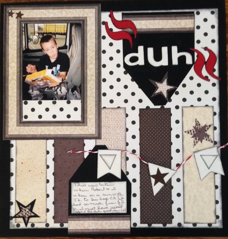
As soon as I read this challenge this pic and the quote popped into my head . When ever one of my kids looked at me with this expression after asking them a question I called it the duh look, because it seemed like their brain froze and their face looked like this. The journaling reads: This was taken when Robert and I went on a run with J.D. to San Diego CA. We had so much fun. J.D. or I must have asked Robert the duh question. lol
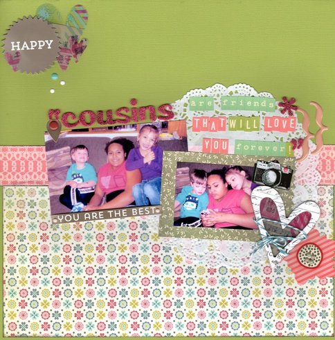
For the challenge, I used this quote "Cousins are friends that will love you forever."
Cousins Are Friends
Cousins Are Friends
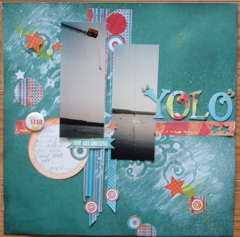
I used a sketch and the inspirational quote "You Only Live Once, but if you do it right, once is enough" from another site's challenge, so here is my hubby bungee jumping after climbing the 150 foot tower after white water rafting all day! "YOLO" in quotes, gives the extra punch, as it is also a somewhat current catch-phrase.
Karrie
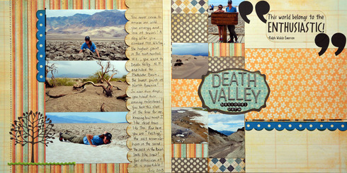
This is my page for this challenge....my big quotes are very old rubons from Autumn Leaves, and I quoted a pre-printed quote by Ralph Waldo Emerson printed on vellum.
This layout captures my DD1's hike into Badland Basin and the Salt Flats in Death Valley NP, the lowest point in North Ameridca---- which she did the day AFTER climbing to the top of Mt. Whitney, the tallest point in the continental U.S.! Energetic woman she is!
PP is MME, rick rack is Wrights, Tree die is LA LA Land, Letter stickers are Doodlebug and American Craft Thickers, Scallop border cardstock is from Bassill, and Rub on borders are from Fontwerks.
"If you obey all the rules, you'll miss all the fun."
Kathy
Kathy
here's my page - I also used it for the music challenge
Here's mine
Mildred - Mom to 2 girls and a husband (I tell people that I am a single mom of 3. Ages 59, 37 and 31) lol. And a proud Grandma to Orahn (7) Sawyer (5) and Mazie (3).
here's another page from me - quote marks on speech bubbles
here's another from me - also used this page for the technique challenge
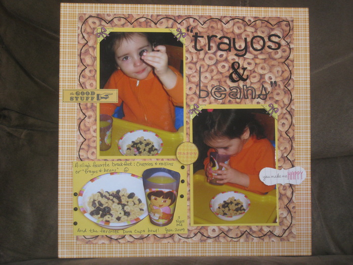
Great challenge! I used this challenge to pay tribute to a funny thing my DD used to say. Trayos & Beans (Cheerios & raisins) was her favorite toddler breakfast. To this day the whole family still calls raisins "beans" LOL!
Happy Scrapping!
Anne-Marie
Anne-Marie
I have never used quotation marks.... I think this works.
Stephanie
Information
Moderators