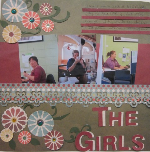
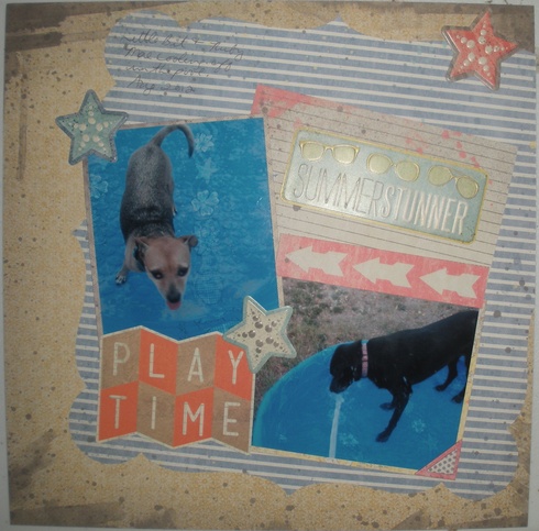
Great layout Donna. Love those flowers with the bling centers and I like how you shadowed the title. Thanks for doing my challenge.Retiree3 wrote:Here is my LO.



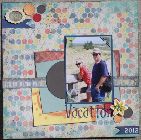
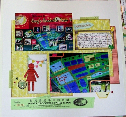
Wonderful layout Janet. Love how those papers bring out te colors of the photo perfectly. Thanks for doing my challenge.scrapy1967 wrote:Love your examples!


Here is my submission. We R Memory Keepers is one of my favorite lines, traditional yet fun! This is from the line Hall Pass 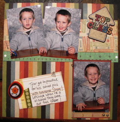

[quote="annette905"]Here is my submission. We R Memory Keepers is one of my favorite lines, traditional yet fun! This is from the line Hall Pass  [/quote
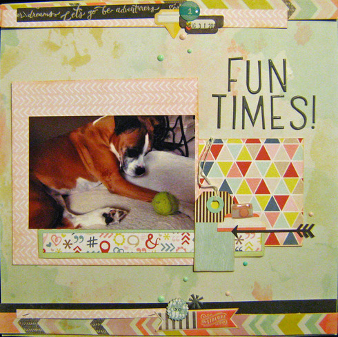
Love how your shool layout is. The colors are perfect and I love the tag with the small clip. Thanks for doing my challenge.
 [/quote
Love how your shool layout is. The colors are perfect and I love the tag with the small clip. Thanks for doing my challenge.


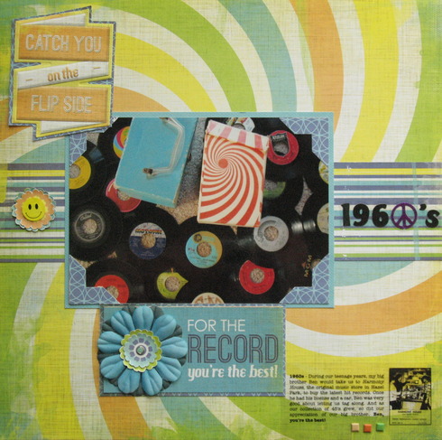
I was inspired by the manufacturer WRMK and Sandi's WDW layout. My layout: For the record, 1960's. I wanted to tell the story of my brother and I going to the music store together to get the latest top hit 45s. My mom had saved the records and worn out cases over the years, so I spread them out on the floor during a recent visit and snapped a few photos. I printed my computer journaling on a transparency so it wouldn't cover up the "psychedelic" background paper. Here's the result:

blfonty a.k.a. Bonnie


The first time I've played with paper in MONTHS. This took a lot longer than I thought it would, especially the sewing part.
I have a very limited supply of WRMK, but was able to find cardstock and the die cut. And of course the sew easy products.
The next longest part was searching Sandy's gallery for a similar die cut. Sandy's layout:
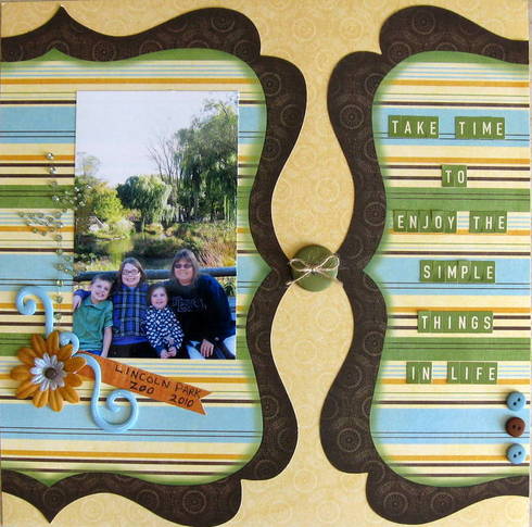
My layout:
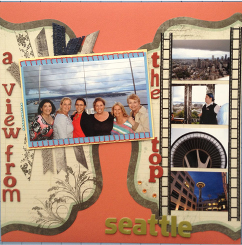
I have a very limited supply of WRMK, but was able to find cardstock and the die cut. And of course the sew easy products.
The next longest part was searching Sandy's gallery for a similar die cut. Sandy's layout:

My layout:

Laurie


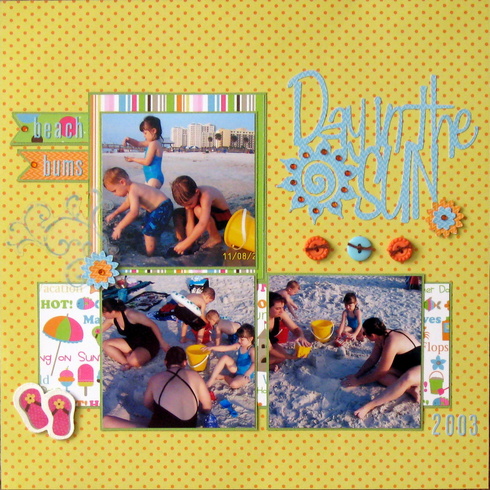 Scraplifting this layout of Sandi's:
 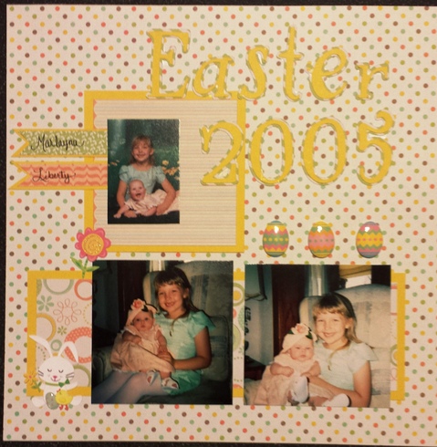 This is my submission!
~Sarah~
here is mine- used chalk board
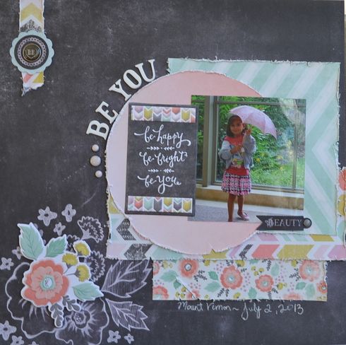

Lori, this layout is fantastic. Love your design and all the embellies. Thanks for doing my challenge.


This layout is awesome. I remember buying 45's. Love your catchy title in the left corner. Very cute. Thanks for doing my challenge.blfonty wrote:I was inspired by the manufacturer WRMK and Sandi's WDW layout. My layout: For the record, 1960's. I wanted to tell the story of my brother and I going to the music store together to get the latest top hit 45s. My mom had saved the records and worn out cases over the years, so I spread them out on the floor during a recent visit and snapped a few photos. I printed my computer journaling on a transparency so it wouldn't cover up the "psychedelic" background paper. Here's the result:


Laurie, you nailed the lift of my layout. Love your layout, the colors you used and how the film strip looks. Thanks for doing my challenge.letumom wrote:The first time I've played with paper in MONTHS. This took a lot longer than I thought it would, especially the sewing part.
I have a very limited supply of WRMK, but was able to find cardstock and the die cut. And of course the sew easy products.
The next longest part was searching Sandy's gallery for a similar die cut. Sandy's layout:
My layout:


Sarah, love your layout and the adorable photos. Great job on the lift. Thanks for the doing my challenge.MacSarah wrote:Scraplifting this layout of Sandi's:
This is my submission!


OMG Ana, this is soooo adorable. She is a "BEAUTY" Love your layout and the layering. Thanks for doing my challenge.anazelia wrote:here is mine- used chalk board


Information
Moderators

