EyesForBeauty wrote:If you know that the purple uniforms photograph more toward the blue you could try your hand at color correcting just the blues on (duplicate copy of) the photograph. this is a little tricky as you want to be careful to adjust only the uniforms and not some other blue area of the photo. I do this fairly often, like on a Christmas shot of my Dad, sister, and her three kids, one of the boys was wearing an orange t-shirt. I thought it stuck out like a sore thumb and clashed with the papers and elements of the kit I was using. So I extracted just the shirt from a separate copy of the photo and using the hue/saturation adjust tool sliding bar nudged it toward the blue (less orange) direction. Or if someone is wearing a very intensely colored item of clothing, that to my eye really sticks out and grabs the attention or doesn't blend well with other photos in my LO, I will reduce the saturation of just that item of clothing--slightly (but not so much that it becomes unrecognizable). Hey, in a recent LO of mine I changed the shirt my DH was wearing from white to turquoise! LOL
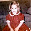
One New Year's Eve Maddie was wearing a purple dress. It had iridescence of blue tones, but it was purple. Well the camera saw it as blue, and only blue. It didn't even look like the same dress in my photos. In every one of them she was wearing a blue dress. I was able to correct the color of the dress in every photo, and just the dress alone. The way I handle color correction (or lightening, darkening, red eye, and other corrections of just a certain area of a photo) is by using adjustment layers and layer masks (Photoshop). I used a Hue/Saturation adjustment layer and adjusted the color of the dress until it was the shade of purple it was supposed to be. This naturally threw off the colors of the rest of the photo, but when making adjustments in this way you ignore what it is doing to the rest of the photo and just focus on getting the area you want corrected. (Even if you are lightening a certain area of the photo, you don't worry about the adjustment washing out the rest of the photo. You just focus on the area you are lightening). After that I inverted the layer mask and the picture was back to it's normal colors. Then I took the paint brush and painted with white the areas of just the dress, exposing the now corrected purple of the dress. (Same thing if you only want a part of the photo lightened or darkened... you just paint the part of that you want lighter. You have to be sure you are using a soft brush so the lightening or darkening blends and you don't get an abrupt change.) Using adjustment layers is awesome because you are not changing the original photo at all. The layers are stacked on the photo. Once you have it the way you want, you can flatten the image, or you can save it with the layers in case you still want to make adjustments later on. I handle red eye the same way. I use an Hue/Saturation adjustment layer to adjust the colors of the eyes, invert the layer mask, and just use a soft brush to paint the eyes and expose the corrected color.
In this layout is one of the photos of Maddie in her purple dress that photographed blue. The rug in the background of the photo is a teal color, which also turned purple when making the color adjustment. Using an adjustment layer I only let the adjustment to the colors of the dress show thru, leaving the colors of the rest of the photo in tact.