http://www.acherryontop.com/gallery/246538
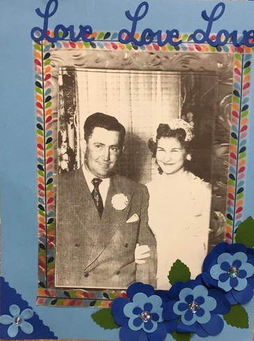
I chose to make the wedding pictures in Sepia to compliment the beautiful paper I used on this layout. I wanted a vintage look. The chapel they were married in was an old stone chapel that had no electricity and was candle lit. I also made another page that goes with this one.
http://www.acherryontop.com/gallery/246540
This is just a picture of the corresponding layout of my entry....just so you can see how they work together.
This is so beautiful that I can't wait to start. Just had to google it: It is believed by some that the modern use of the phrase stems from an article by Fred R. Barnard in the advertising trade journal Printers' Ink, promoting the use of images in advertisements that appeared on the sides of streetcars.[4] The December 8, 1921, issue carries an ad entitled, "One Look is Worth A Thousand Words." Another ad by Barnard appears in the March 10, 1927, issue with the phrase "One Picture Worth Ten Thousand Words", where it is labeled a Chinese proverb. The Home Book of Proverbs, Maxims, and Familiar Phrases quotes Barnard as saying he called it "a Chinese proverb, so that people would take it seriously."[5] Nonetheless, the proverb soon after became popularly attributed to Confucius. The actual Chinese expression "Hearing something a hundred times isn't better than seeing it once" (百闻不如一见, p bǎi wén bù rú yī jiàn) is sometimes introduced as an equivalent, as Watts's "One showing is worth a hundred sayings".[6] This was published as early as 1966 discussing persuasion and selling in a book on engineering design.[7] In March 1911, in the Syracuse Advertising Men's Club, Arthur Brisbane wrote: "Use a picture. It's worth a thousand words."[8]
I am hoping to get to this one soon!
Hi everyone! My name is Susan and I love to scrapbook!




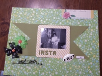
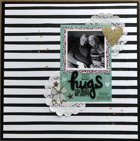
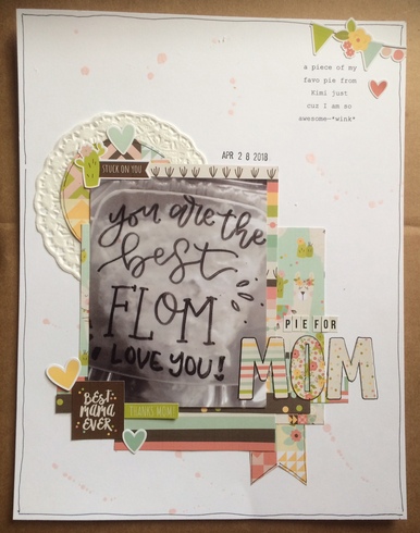
This is mine - my husband and granddaughter were wearing different colors and thought changing the photo to black and white would be better.

Barb - thanks for this interesting history lesson on the use Black & White!bvandoes wrote:This is so beautiful that I can't wait to start. Just had to google it: It is believed by some that the modern use of the phrase stems from an article by Fred R. Barnard in the advertising trade journal Printers' Ink, promoting the use of images in advertisements that appeared on the sides of streetcars.[4] The December 8, 1921, issue carries an ad entitled, "One Look is Worth A Thousand Words." Another ad by Barnard appears in the March 10, 1927, issue with the phrase "One Picture Worth Ten Thousand Words", where it is labeled a Chinese proverb. The Home Book of Proverbs, Maxims, and Familiar Phrases quotes Barnard as saying he called it "a Chinese proverb, so that people would take it seriously."[5] Nonetheless, the proverb soon after became popularly attributed to Confucius. The actual Chinese expression "Hearing something a hundred times isn't better than seeing it once" (百闻不如一见, p bǎi wén bù rú yī jiàn) is sometimes introduced as an equivalent, as Watts's "One showing is worth a hundred sayings".[6] This was published as early as 1966 discussing persuasion and selling in a book on engineering design.[7] In March 1911, in the Syracuse Advertising Men's Club, Arthur Brisbane wrote: "Use a picture. It's worth a thousand words."[8]
blfonty a.k.a. Bonnie


[
Donna-Retiree3-Proud Grandmother of Three Boys!
[highlight=#000000][/highlight]
Donna-Retiree3-Proud Grandmother of Three Boys!
[highlight=#000000][/highlight]
lissahope26 wrote:Here is my entry also added to the gallery spot
so precious!
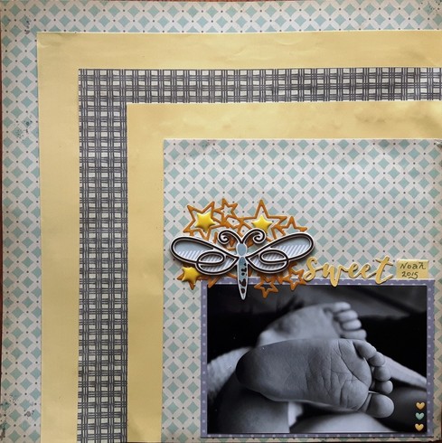
sweetsour wrote:I chose this baby blue, yellow and grey scheme for my B&W photo.
(then I made this kit for Krystle's kit game not realizing she was having a separate challenge with it, but am not entering in hers. so if that's considered combining and doesn't count that's OK.) I love the page anyway!
love your background layering
This was a great challenge Barb!
I chose to print these photos in sepia to give them a feeling of a time long gone. We had a themed birthday party for my sister. Her family did civil war reenacting so her party was set in the time period.
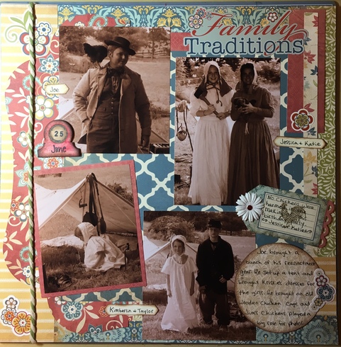
I chose to print these photos in sepia to give them a feeling of a time long gone. We had a themed birthday party for my sister. Her family did civil war reenacting so her party was set in the time period.

Jill
Jill


Jill


I love your examples, and I love watching Maddie grow. She's a young lady now.
this layout gave me fits...wouldn't come together right...finally stuck a fork in it...

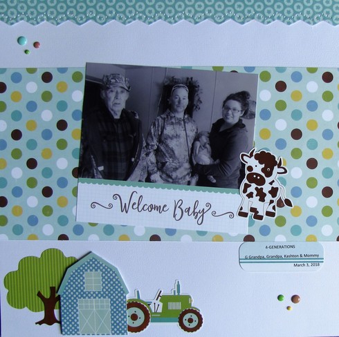
Here is mine...Looks like I have pink enamel dots on this, I need to change that. LOL! DH is Great Grandpa, our son is Grandpa, our GGS Kashton and our GD Miranda is Mommy.

Linda I love your layout. What is this paper collection? It works great with you picture too!
I think it looks beautiful, Carrie! I love the colors on here!CarrieG wrote:this layout gave me fits...wouldn't come together right...finally stuck a fork in it...

***Berta***


That's a great photo, Linda! I love your farm elements on here...too cute!Linda-1949 wrote:Here is mine...Looks like I have pink enamel dots on this, I need to change that. LOL! DH is Great Grandpa, our son is Grandpa, our GGS Kashton and our GD Miranda is Mommy.

***Berta***


I love your design on here and your really fun title!janannemd wrote:

***Berta***


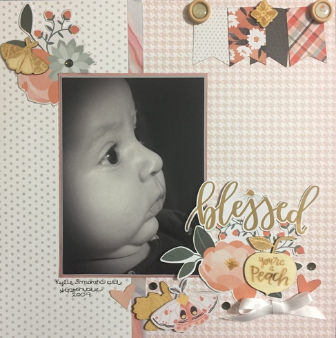
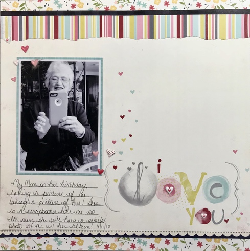
Here's mine, Barb, I really enjoyed this challenge! This picture in color would most definitely not have worked with the color scheme I used, I'm so happy with how it turned out using a b&w photo.
Best Son Ever
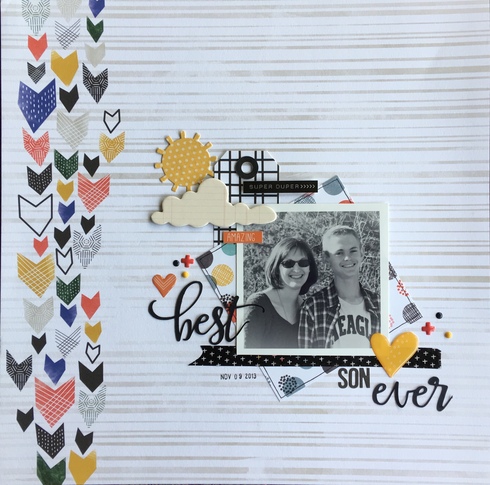
Best Son Ever

Stacy





Information
Moderators


