Surehsblair wrote:That is certainly an interesting picture to work off of...
If I were to scrap pictures from Comicon, would the subject be enough inspiration?
Nice work! Love the receipt!Danibuttons wrote:N
Love your LO. Is that really a comic book above? don't look like I remember from childhood.
Debbie
Yes, it is an actual comic book. My DH buys some for me that he thinks have some cool graphic designs...and then he gets to read them!debamas wrote:Love your LO. Is that really a comic book above? don't look like I remember from childhood.

LOL, double duty!1scrappymom wrote:Yes, it is an actual comic book. My DH buys some for me that he thinks have some cool graphic designs...and then he gets to read them!debamas wrote:Love your LO. Is that really a comic book above? don't look like I remember from childhood.
Debbie
HERE IS A BETTER PHOTO OF MY LAYOUT! although it is more vibrant on the paper part I don't understand why you can't clearly see the beautiful butterfly photos. I hate having to take my photos with my phone.
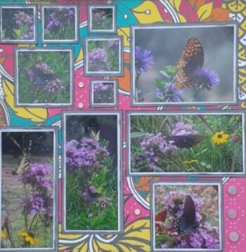

Last edited by paulaj on Wed May 06, 2015 5:51 pm, edited 1 time in total.
I was inspired by the colors and the grid. Here's my layout.
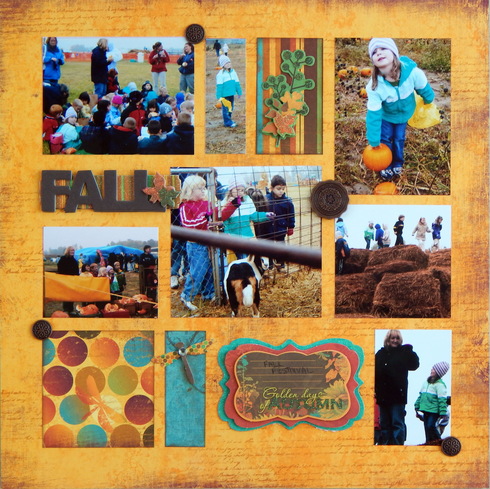


Another beautiful autumn layout! Love the paper choices and such cute photos!
Sandi0805 wrote:I was inspired by the colors and the grid. Here's my layout.
I have been so frustrated trying to get a good photo of this layout. Using a phone to take photos is the WORST! I am hoping I will be happy with this one. I'm going to go back and see if I can delete the excess ones. I'd like to delete the excess in my gallery but don't want to lose the sweet comments. Does anyone know if there Is there anything I can do about that?
I knew exactly which paper line I was going to use the minute I saw the comic inspiration. I've had it forever and I was happy to use it. I ended up using a few sheets from the line and fussy cutting one of them a lot! I think I may be able to get a better photo outside tomorrow but here it is for now.
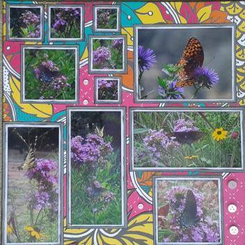
I knew exactly which paper line I was going to use the minute I saw the comic inspiration. I've had it forever and I was happy to use it. I ended up using a few sheets from the line and fussy cutting one of them a lot! I think I may be able to get a better photo outside tomorrow but here it is for now.

You guys have all done such an amazing job!!!
Here is my entry for the NSD Comic Book Challenge. I was inspired by the theme of the comics and the colors in the inspiration photo.
http://www.acherryontop.com/gallery/206662
http://www.acherryontop.com/gallery/206662
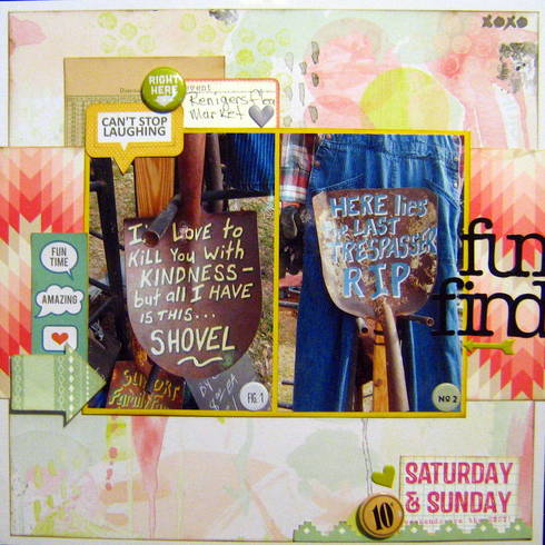
I chose to got with the wild background and the color the wild background. Great challenge!


GOTTA do this one today - My son's at Philadelphia Comic Con from yesterday until Sunday.
Here's mine! It was a challenge, but I'm glad I did it--had so much fun with my gelatos!
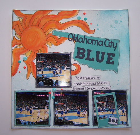
I used my gelatos to make the sun and drew around on it with a marker to give to mimic the sun on the comic book prompt. I also used square photos like the prompt. Fun challenge--I just went crazy and like the result!
I used a few things for the Bonus challenge, too:
#18 frame
#5 turquoise and orange
#19 camera embellishment (die cut)
Kim



This is totally not my usual style but trying to incorporate some elements from the comic book including black and bold colors. I also went with all the chevrons and stripes for a graphic feel.
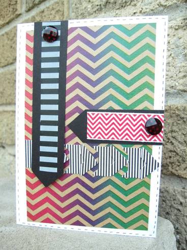

****Kelly****
The inspiration I took from the comic: black & white with bright colors and square photos.
http://www.acherryontop.com/gallery/206749
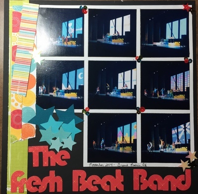
http://www.acherryontop.com/gallery/206749

I was inspired by the black and orange and the mixture of so many colors.
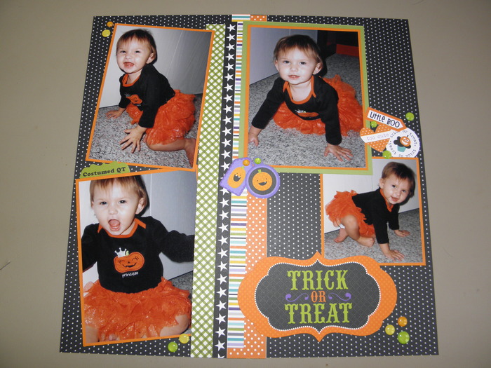



Got mine done. Sorry for bad night time photo.
I was inspired by the subject, all the squares, and how the 2nd half of the comic book page was half black.
Oh, I should mention that I used a REALLY old Becky Higgins sketch for this one.
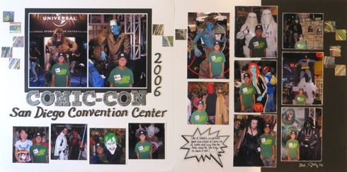
I was inspired by the subject, all the squares, and how the 2nd half of the comic book page was half black.
Oh, I should mention that I used a REALLY old Becky Higgins sketch for this one.


Information
Moderators




 This was a very creative challenge!!! Thanks!